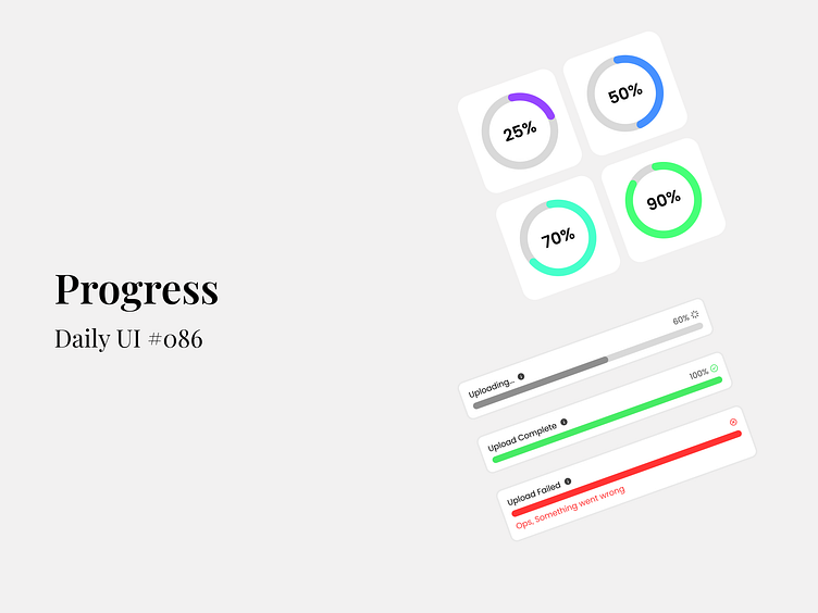
Progress - Daily UI #086
Whether it’s uploading files or tracking progress, a clean and intuitive design can make all the difference in user experience! Here's my take on progress indicators—from circular percentages to horizontal bars with status alerts. 🔄✅❌
🔍 Key Features:
Simplicity: Minimal yet functional UI elements to keep the user informed at every step.
Clarity: Distinct color-coded indicators for success, failure, and in-progress states, ensuring no confusion.
Consistency: Smooth and modern design across all progress elements for a seamless user experience.
🧑💻 This design not only enhances user interaction but also fits perfectly into any product that prioritizes UX. What are your thoughts? Let’s connect and discuss how we can implement UI that makes users feel guided every step of the way. 🎯
------------------------------------------------------------------------------------------------------------
Let's talk and Collaborate:
