Wellness Ap
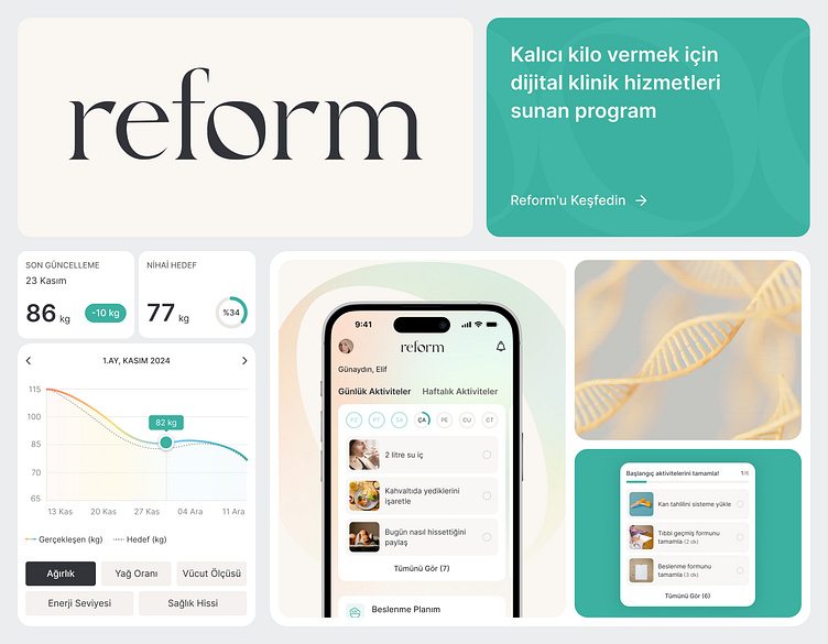
Reform Health, an app offering a scientifically backed, personalized weight loss program for which I had the opportunity to design the branding, app UI screens, and website, is now live! 🥳
Based on the concepts we developed during the branding workshop with the team, we decided to move forward with this design, which resonated with us the most and seemed best suited to the target audience. The design emphasizes the uniqueness and form of the human body. By altering the form of the “O” in Reform, I aimed to symbolize the organic structure of the human body, the diversity of body types, and the role of genetics. The circular shape of the “O” also reflects the anatomical roundness of the human form, reinforcing the importance of a personalized approach in health and wellness.
In choosing the color palette, I selected pastel colors to create a calming and trustworthy atmosphere for users as they engage with the app.
Although it was an MVP project with many tasks to handle in a short timeframe, I believe we did a great job together. As a designer, I observe that in projects like this, adopting a “good enough” approach as a team and remembering that the product is an ever-evolving, organic entity is an important mindset to have.


