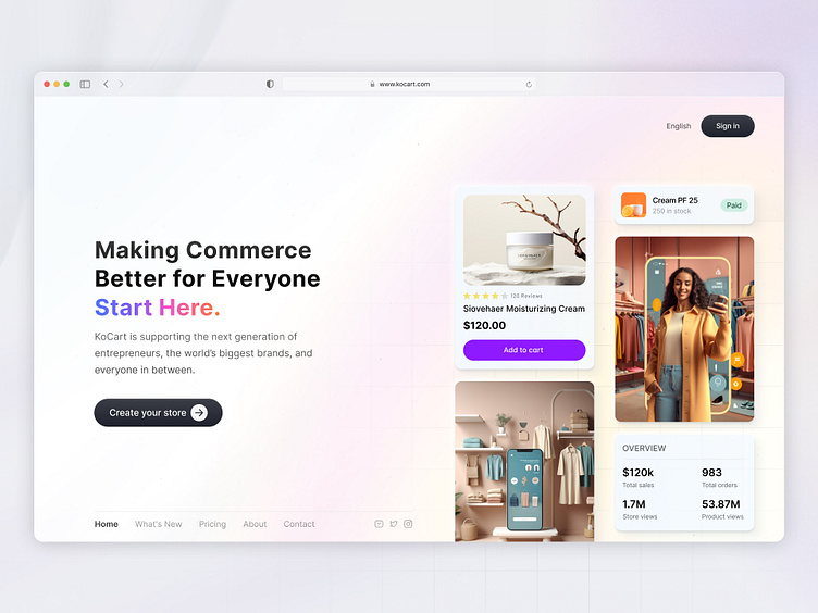
E-commerce Landing Page
KoCart is here to revolutionize the way we approach online commerce, and I’m thrilled to share this sleek and modern landing page design!
Key Design Features:
Bold Headline with Gradient Accent: The eye-catching headline emphasizes KoCart's mission to make commerce better for everyone, with a gradient "Start Here" that subtly draws the user’s attention.
Product Highlights: Featured products, including the Siovehaer Moisturizing Cream and an e-commerce outfit section, showcase KoCart’s ability to support diverse business offerings—from beauty to fashion.
Conversion-focused CTA: The "Create your store" call-to-action is bold and invites new users to start their journey effortlessly.
User-friendly Navigation: A minimalistic menu ensures a smooth browsing experience, guiding users to explore what's new, pricing, and more with ease.
Performance Metrics Overview: The store overview provides a snapshot of e-commerce success with impressive numbers: 120k total sales, 1.7M store views, and 53.87M product views.
Aesthetic Balance: The design uses soft gradients and sleek UI elements, creating a modern and welcoming platform.
Supporting the next generation of entrepreneurs and brands, KoCart provides an exceptional platform for everyone. Let me know what you think about this design in the comments below!
Looking for UX/UI Designer for Project?
💌Send me message:sohaguixd@gmail.com
Thanks for watching. Have a good day 💙
