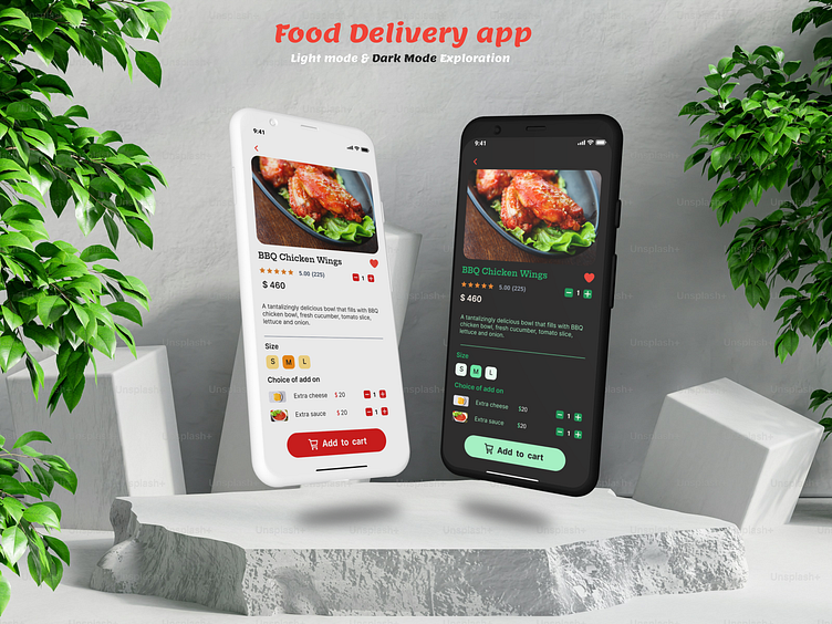
Food delivery/Food ordering app ui
Food Delivery App UI – Dark & Light Mode Exploration
Introducing a clean and intuitive food delivery app designed for seamless user experience across different visual preferences. This mock-up features two distinct modes:
1. Light Mode: A clean, minimalistic design that enhances readability and creates a fresh, vibrant feel. Ideal for daytime use or users who prefer a brighter interface. The light theme ensures that the food imagery pops, providing an appetizing visual experience.
2. Dark Mode: An elegant, modern interface crafted for users who prefer a more subdued and eye-friendly experience, especially in low-light environments. The dark theme not only reduces eye strain but also highlights the vibrant food images with striking contrast.
Key Features:
1. Easy Navigation: A smooth, intuitive navigation flow that lets users browse, order, and track their deliveries with ease.
2. Responsive Design: The layout adapts perfectly across devices, ensuring a consistent experience whether on mobile or tablet.
3. Visual Hierarchy: Both modes strongly emphasize user interaction by utilizing strategic color schemes, typography, and spacing to guide users through the app seamlessly.
About Me:
I'm a passionate UI/UX designer focusing on creating clean, user-friendly interfaces that balance aesthetics and functionality. I love crafting designs that enhance the user experience while bringing brands to life through visual storytelling.
Feel free to reach out for collaborations or freelance inquiries: [ ishratzahan8@gmail.com ]
Always excited to connect and create!
