Druva Redesign
🔐 Redefining Data Security with AI Integration
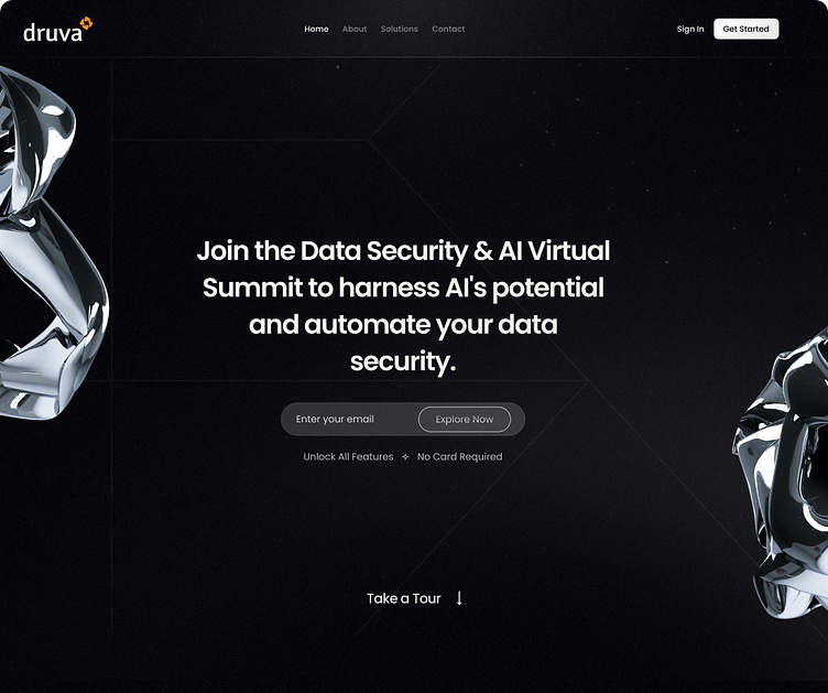
Excited to share our latest redesign for Druva's landing page! The focus here was to modernize the interface while emphasizing Druva's leadership in AI-driven data security.
We incorporated a sleek, dark theme with futuristic 3D elements to reflect the cutting-edge nature of their solutions. The CTA is clear and prominent, inviting users to explore the platform and learn how AI can automate their data security without friction.
🎨 Design Highlights:
Minimalistic dark theme to enhance focus on content and visuals.
3D elements for a modern, tech-forward feel.
Simple and intuitive UI that drives user engagement with a bold CTA.
Clean typography to keep the message clear and compelling.
🔐 Cloud Data Security – Empowered by AI
Continuing with the Druva redesign, the features section showcases the next-gen capabilities of AI-powered data security. I kept the visual aesthetic consistent with the landing page by utilizing a sleek dark theme while introducing dynamic 3D elements to communicate innovation and sophistication. The goal here was to make complex data protection features more approachable and visually engaging.
🎨 Design Highlights:
Clean, minimal layout that ensures key features stand out.
3D visuals that abstractly represent AI and automation, reinforcing the technical prowess of Druva's offerings.
Intuitive CTA buttons like Explore, Get Started, and Upgrade Now that guide users through the solutions.
Smooth contrast between light typography and bold accent colors for important actions.
Interested to collaborate? Let’s connect!
f you're looking for a design partner for your next SaaS project, drop us a line, and let's talk about how we can help you achieve your goals.
Contact us at vipul@weframetech.com
📬 We're available for new projects.
Take a peek at our website and drop a hello!


