Daily UI #011 - Flash message
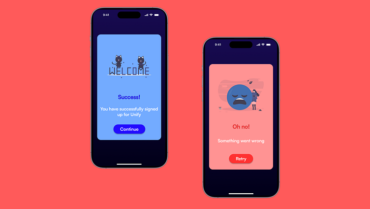
For Day 11 of my 100-day UI challenge, I worked on flash messages for success and error states. These screens aim to provide clear and immediate feedback to users during key actions. Whether they succeed 🎉 or something goes wrong 😔, the goal is to keep the experience smooth and visually engaging.
💡 Success Screen: Featuring playful illustrations and a bold blue tone, this screen congratulates users with a friendly vibe.
💡 Error Screen: Using warm red tones and simple icons, this design gently notifies users when something doesn’t go as planned, offering an easy retry option.
Drop your thoughts below, I’d love to hear your feedback! 💬✨
More by Saksham View profile
Like


