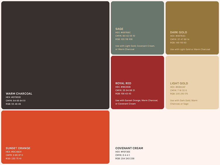
Color Palette for Christ the King Presbyterian Church
Colors
The CTK color palette was carefully chosen to express warmth, reverence, order, and balance.
This versatile palette allowed the CTK brand to take on a more serious tone when the need arises. These colors also translated well to fabric and textiles, making them great for t-shirts, paint, and other real-world applications.
More by Braden East View profile
Services by Braden East
Like


