Modern and Bold Concert Ticketing App Design
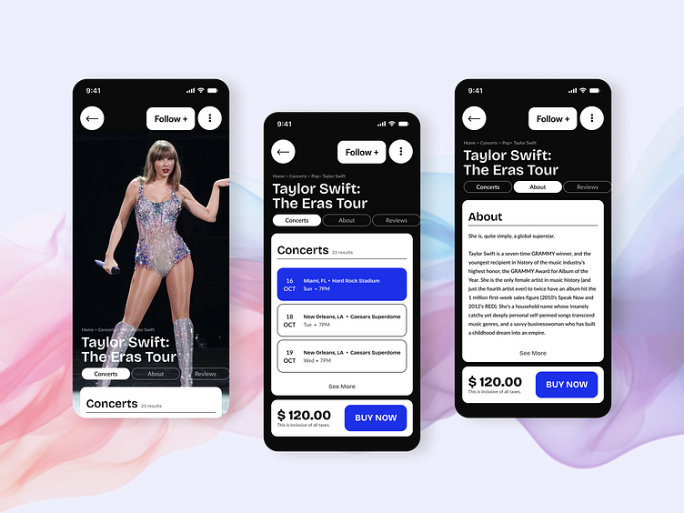
This concert app design aims to capture the energy and excitement of today's youth culture. By utilizing a bold, monochromatic color palette and dynamic typography, we create a visually striking and immersive user experience. The dark background provides a modern and sophisticated aesthetic, while the strong font styles enhance readability and convey a sense of boldness. This design approach reflects the preferences of younger generations, who are drawn to visually engaging and intuitive interfaces.
Key UX considerations while the brainstorm of the design:
Visual Hierarchy: Think of it like a concert stage: the most important information is front and center, while the rest of the details are there for your exploration.
Accessibility: We've made sure everyone can enjoy the show, regardless of their vision. It's like turning up the volume for everyone.
Emotional Connection: This app isn't just about finding tickets; it's about capturing the excitement and anticipation of a live show.
Intuitive Navigation: It's like having a personal backstage guide who knows the best way to get to the stage.