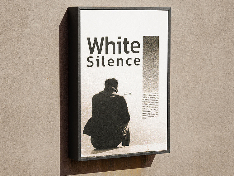
White Silence Poster Design
Here’s another poster inspired by my recent studies of Swiss design. The photography was taken about three years ago, and I felt it was perfect for this project. I aimed to create a balance of white space to convey feelings of solitude and silence. I’m excited about the noise effects I developed for the color gradients, using a combination of techniques from my experience and tutorials. More posters are on the way, and I can't wait to share them with you!
Hope you enjoy it!🏂
More by Alireza Rahdar View profile
Like

