Bathos - Arch Studio Brand Guidelines
Introduction
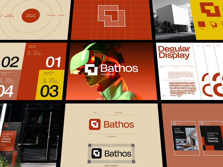
Bathos Architecture Studio, a forward-thinking firm focused on modern design, interior, and architecture, sought to create a brand identity that not only reflects their architectural aesthetic but also stands out in the industry for its emphasis on innovation and technology. They required a cohesive visual system that communicates their values—precision, depth, and attention to detail—across multiple mediums.
Objectives
Create a distinct logo and visual identity that reflects Bathos Studio’s modern architectural approach.
Develop a flexible color palette that feels fresh, modern, and professional while maintaining a sense of creativity.
Establish a typographic system that is both functional and bold, aligning with the studio’s focus on clarity and structure.
Design cohesive marketing materials including social media templates, signage, and visual guidelines.
Incorporate futuristic elements to showcase the studio's integration of cutting-edge technology, such as VR in architecture.
Design Process
Logo & Icon Design:
The logo features a structured, geometric design that reflects architectural principles—solid shapes, clean lines, and balance. The icon is constructed using a modular grid system, which is visually aligned to the firm's approach of organized, thoughtful design. The use of squared-off edges and minimal detailing evokes a sense of precision and professionalism.
Typography:
The primary typeface selected is Degular Display. This typeface provides the necessary boldness for impactful communication but retains enough subtlety to be used in long-form content. The typeface family (Thin, Regular, Bold) ensures versatility across different applications, from large signage to website copy. The design layout features strong, prominent numbers and letters to convey structure and clarity.
Color Palette:
The color palette includes a Sicilian Red as the primary color, which evokes warmth and confidence, contrasted with secondary colors like Briston Yellow and Terracotta. These colors not only reflect the modern, grounded nature of the architecture industry but also provide flexibility in various marketing materials. Cream Beige adds a neutral tone that helps balance the more vibrant hues.
Primary Colors:
Sicilian Red: HEX #B1110C
Cream Beige: HEX #EDAB8B
Secondary Colors:
Briston Yellow: HEX #EDB500
Terracotta: HEX #B94830
These colors work together to evoke sophistication and creativity while grounding the design in earthy, architectural tones.
Marketing & Social Media Materials:
The case study includes sample marketing materials that are consistent with the visual identity. Social media templates are designed with strong grid layouts, ample white space, and the studio’s branding colors and typography. The layouts are modular, allowing for easy customization for different types of content (e.g., announcements, project features, and client testimonials).
Technology and Innovation:
In one of the key images, a VR headset is showcased as part of Bathos Studio’s innovative side. This element ties in with the firm’s use of cutting-edge technologies to provide immersive design experiences for their clients. The futuristic tone is reinforced through bold, tech-inspired visuals, offering a glimpse into the firm’s approach to blending traditional architecture with modern advancements.
Applications
Exterior Signage: The logo and visual identity are extended into the physical space, as shown in the building's signage. The design language remains clean and minimalistic, allowing the architecture to speak for itself while still providing clear brand recognition.
Website and Digital Presence: The brand identity translates effectively into digital platforms, with a clear hierarchy, bold visuals, and a user-friendly interface. The application of vibrant colors, modular grids, and strong typography across the website enhances user experience and brand perception.
Stationery and Corporate Materials: All brand stationery and corporate materials follow the same visual identity guidelines, ensuring consistency and professionalism in every touchpoint, from business cards to company documents.
Let's collaborate with us
🛍️ Download our Premium UI Kit on
Follow our pages and join the journey
Instagram | LinkedIn | Behance


