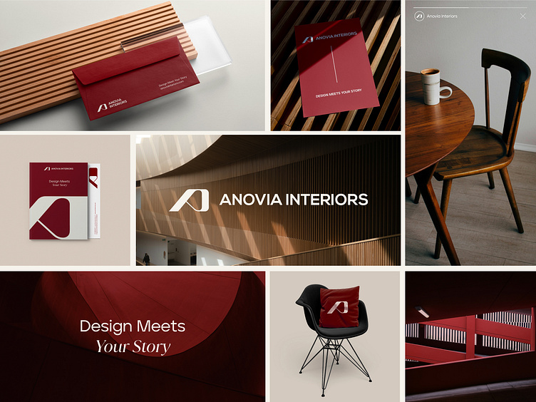
Anovia Interiors Branding
When Design Tells a Story ✒️
Anovia Interiors’ brand is more than just visuals—it’s a reflection of their bold, refined approach to creating timeless, personalized spaces.
We developed a complete identity system centered around a modern “A” emblem, symbolizing Anovia’s refined, bold approach. The adaptable visual language seamlessly works across both digital and print for consistent brand presence. To further enhance the identity, we chose Red Blood as the primary color, complemented by ivory, Timberwolf, and eerie black—balancing elegance and modernity. This cohesive system allows for creative flexibility while maintaining a strong, cohesive brand across all platforms.
More by Over&Over Design Studio View profile
Like


