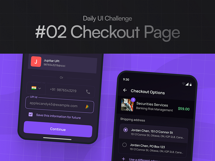
Dail UI Challenge #02/100
Hey there!
Day 02 of the 100-day UI challenge: Checkout screen. Today’s design focuses on creating a smooth and straightforward checkout experience, keeping it clean and easy to navigate. I wanted to make sure the process feels seamless and user-friendly, with clear CTAs and a minimalist layout. Would love to hear your feedback on this one!
More by Pallab Biswas View profile
Like


