Brand Identity: Nob-Hill Catering
Case Study
Brand Identity
The Flipbox Design team has designed a brand identity for a London-based catering company, Nob-Hill Catering. The company needed a logo and a comprehensive brand identity to communicate with its target audience. Different colour palettes were used, and other approaches that required a more robust brand guide led to manufacturers and users needing to understand their brand identity.
Their marketing team also needed help maintaining the previous branding when creating digital marketing assets. They had a website in place but needed help with their day-to-day operations. With new competition in London, the company also gave the Flipbox design team the responsibility of handling the website design and development.
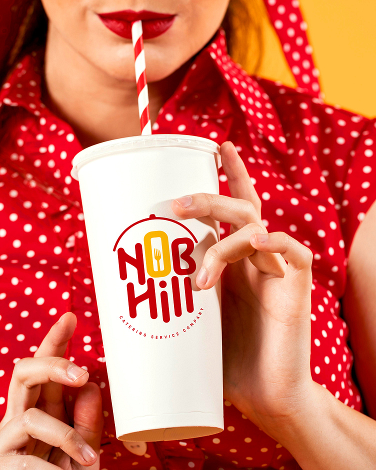
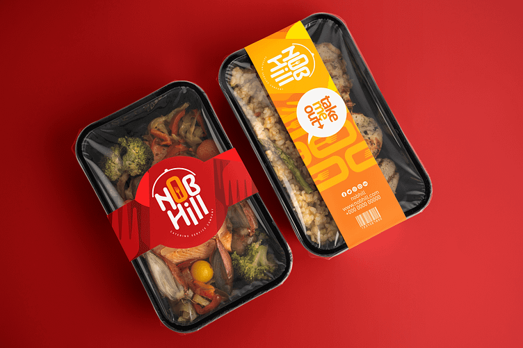
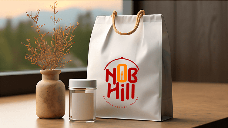
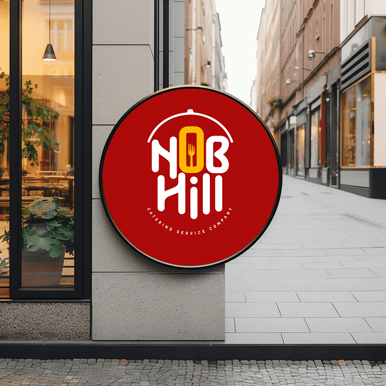
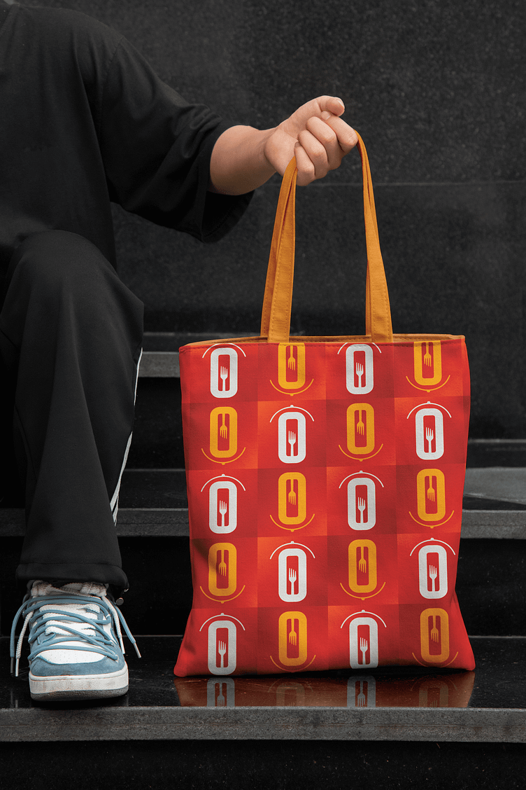
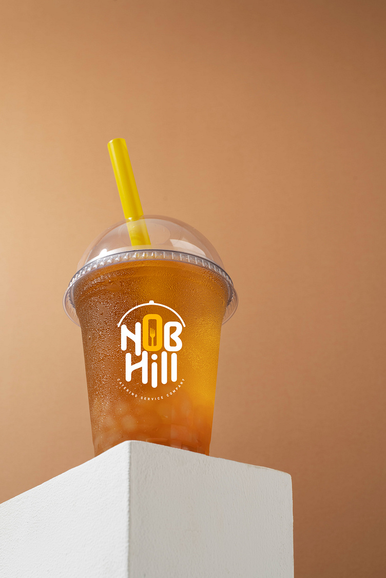
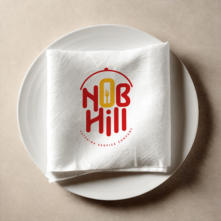
The logo’s intricate design, inspired by nature and the culinary landscape, is a testament to NHC’s commitment to excellence. The symbolic fork communicates culinary prowess, while the curvy fonts create a welcoming atmosphere. The red and gold palette evokes a sense of celebration, aligning with NHC’s values of warmth and hospitality. The ‘Rambling’ font in the logo is distinctive and memorable, fostering a connection with NHC’s customers.
The hues create a visually striking and emotionally resonant colour palette that reflects Nob Hill’s commitment to excellent catering services in the industry. The Flipbox design team carefully analysed the design and preserved its essence by providing its form and shape consistency.
