Re-branding: Rumax Limited
Case Study
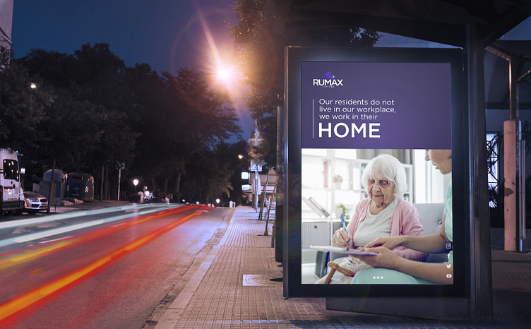
Founded in 2010, RUMAX Limited is one of the UK’s most trusted care providers for patients and clients, delivering comprehensive and compassionate health and social care services.
Rumax approached Flipbox to rebrand its organisation. It has had branding for the past 13 years but must be defined regarding the logo and colour palette. The Flipbox design team created a new visual identity, including a logo, typography, colour palette, and graphic language. These all function together to create the newly rebranded Rumax Limited.
We completely revamped Rumax’s branding colour palette, making significant enhancements and changes. Our primary objective was to infuse the brand with new energy and vitality. The previous colours used by Rumax needed to be more muted and capture the brand’s dynamic and vibrant spirit.
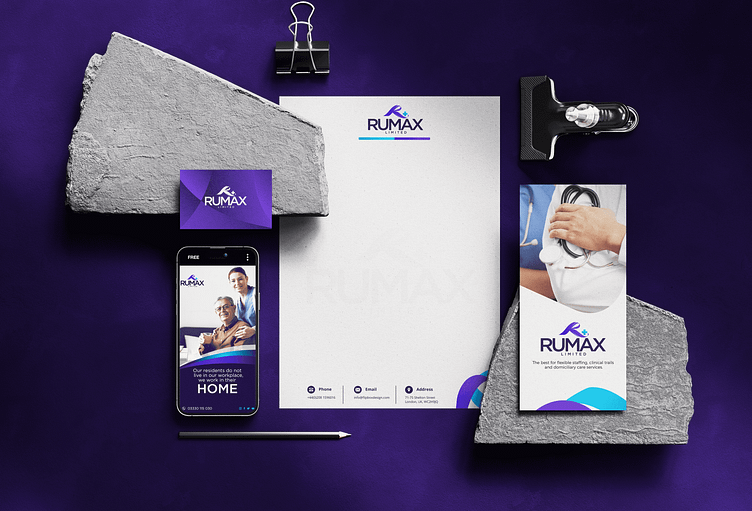
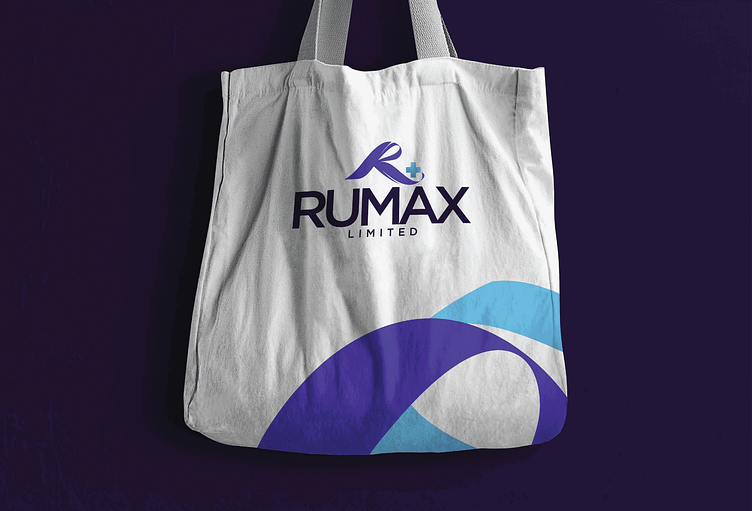
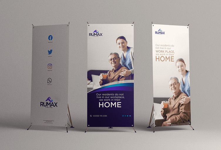
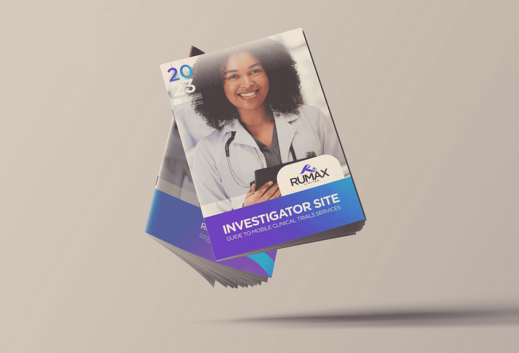
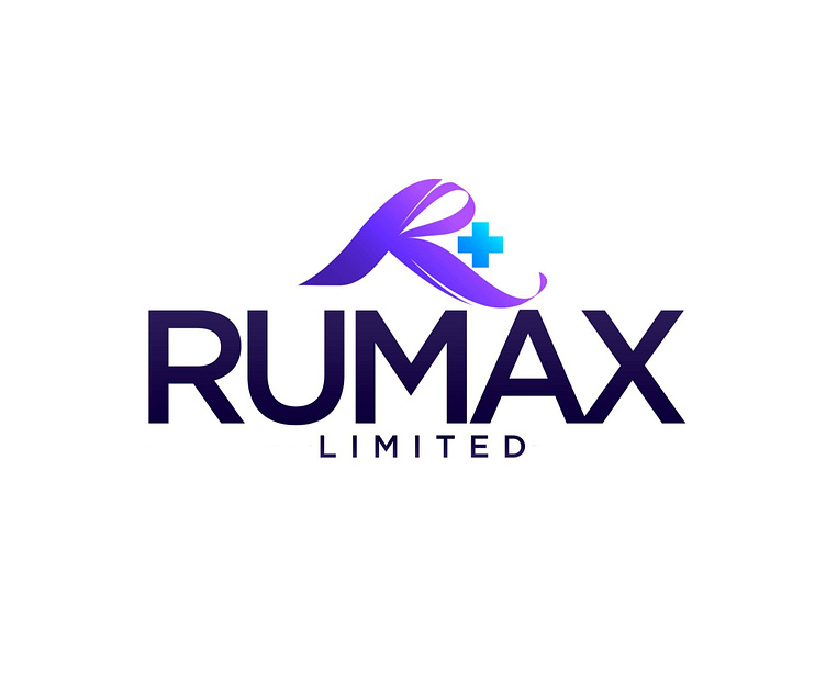
The Rumax logo is easily recognisable with its unique letter R design that resembles a helping hand, with a cross that reflects the company’s area of specialisation – medical-related services, specifically clinical trials. Underneath the stylised R, the letters RUMAX are written in uppercase.
Overall, the logo represents the brand identity and conveys the industry in which Rumax operates. The new identity is focused on the use of colour. The colour scheme combines modern, bright, and warm colours. Muted shades have also been incorporated to balance out the vivid colours. This enables the creation of adaptable colour combinations that are easily recognisable across Rumax and the brand assets developed by the Flipbox team.