Goodreads app [book tracking app]
Enhancing the Goodreads User Experience: A Product Design Perspective
During my job search, I encountered an exciting challenge: selecting an app I enjoy and proposing improvements to enhance its user experience. As a long-time fan of Goodreads, I chose it for this task. However, while I love many of the app's features, I quickly realized that suggesting improvements presented a unique challenge.
Goodreads offers a wide range of functionalities that I, as a user, truly appreciate. But there are areas where I believe changes could make the experience more streamlined and engaging. My main goal was to avoid overwhelming the user, while still emphasizing important features. Here are the results of my design exploration:
Key Improvements:
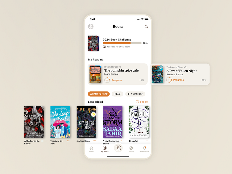
1. Moving the Yearly Challenge to the Top of the Page: Currently, the "Yearly Reading Challenge" is buried at the bottom of the page in the iOS design. Since this feature motivates users to track their reading goals throughout the year, I moved it to the top. This provides users with an immediate reminder of their progress and encourages them to stay on track with their reading plans.
2. Enhancing the “Reading Now” Section: I added a "Reading Now" section just above the Yearly Challenge. This feature directly connects with the reading challenge, as users can easily update their progress when they finish a book. The ability to update the reading status from the main page, which is currently available in iOS but not Android, would eliminate unnecessary clicks, enhancing the app's overall usability.
3. Streamlining the Book Status Tabs: After the "Reading Now" section, I introduced three key tabs: "Want to Read," "Read," and "Create a New Shelf."
- "Want to Read": This is the default tab that displays the most recently added books. It allows users to easily manage their book lists and update their reading status when they start a new book.
- "Read": This tab highlights the user's most recently finished books, offering a quick view of their completed reading history.
- "Create a New Shelf": After reviewing user feedback, it became clear that creating and managing shelves is a pain point. Users often struggle with organizing their books across different shelves. I simplified the process by allowing users to create a new shelf directly from the main page. Additionally, users can now assign books to these new shelves when updating their reading status.
My Design Goal:
The core of my redesign was to declutter the interface and prioritize important features, creating a more intuitive flow. By making these enhancements, the user experience becomes more engaging and functional without overwhelming the user.
I would love to hear your thoughts on these ideas, and if you have any further suggestions for improvement, I’m happy to consider them
