Brand Identity: Lohana Lifestyle
Case Study
The Indian-based start-up company reached out to the Flipbox team to design Its brand identity. Classic and contemporary was the team’s approach towards developing the Lohana Lifestyle identity. your The project follows Lohana Lifestyle’s messaging and art direction of its fashion photography, as well as the design and development of the website. Simplicity and timelessness were at the top of the designer’s priority to follow Lohana Lifestyle’s design language and approach to its first collection.
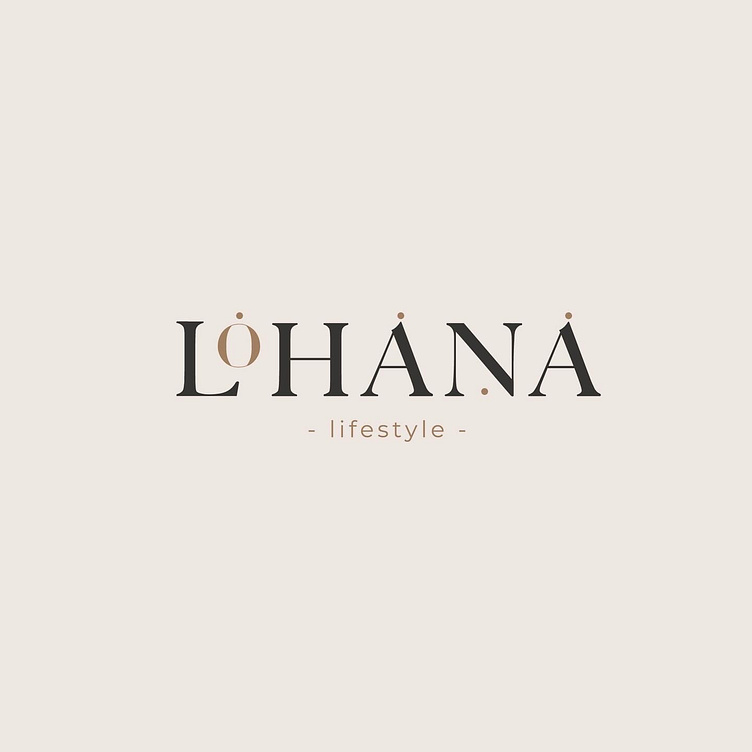
Designers developed two logo concepts which complement each other. The first logo plays around customised typography in uppercase letters LOHANA with the ‘O’’ on top of the ‘’L’’; the custom logo font gives the audience no chance to mispronounce the brand. The several ‘’O’’ emphasis that can also be seen on top of the logo fonts continues to emphasise pronunciation. The team also developed an alternative symbol logo, ‘’LL’’ for Lohana Lifestyle, circled in an uneven circle that represents the balance in the ecosystem, a bold statement towards Lohana Lifestyle’s mission and vision.
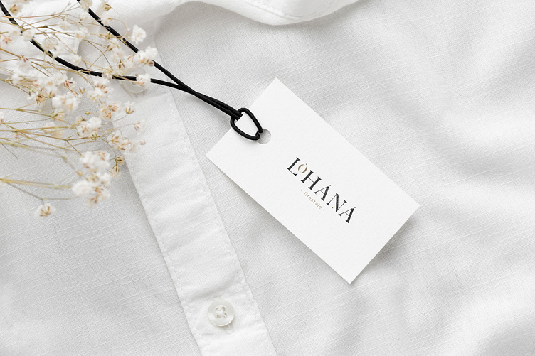
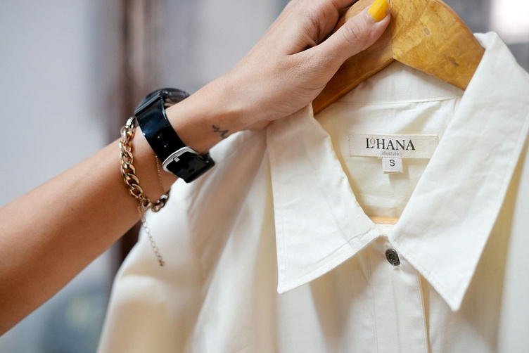
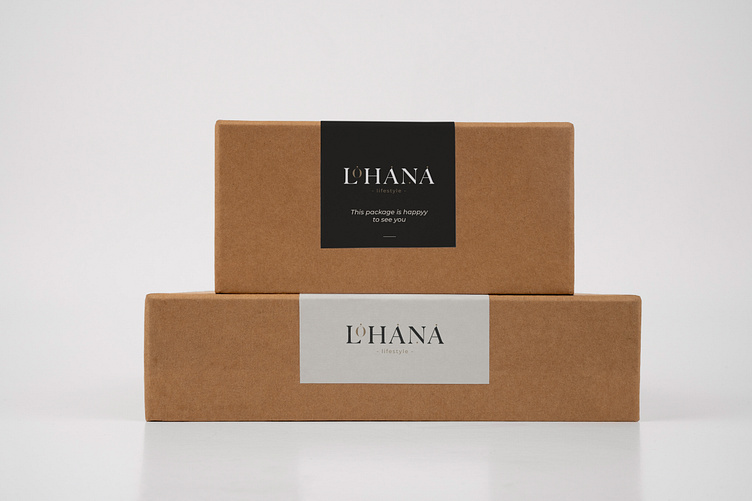
The team designed several brand assets, including interior 3D visualisation of Lohana Lifestyle’s workplace. The colour pallet is applied to all of Lohana’s brand assets.