BrandHive
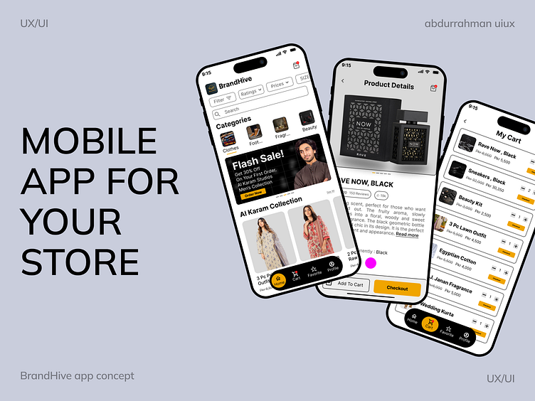
.As for the color palette, I've chosen a combination that balances aesthetics with functionality. The primary color #000000 (black) serves as a bold foundation, ensuring that essential elements like text and icons are highly visible and easy to read. To create emphasis and highlight important actions, I used #F0A500 (mustard yellow), which adds a pop of vibrancy, drawing the user's attention to interactive components such as buttons. Lastly, #505050 (gray) is applied for secondary text and less prominent elements, offering a subtle contrast that complements the overall design while maintaining a clean, modern look.
Introducing BrandHive 🛒, a sleek and modern mobile app concept designed to elevate your online shopping experience 🛍️. The UI focuses on simplicity and ease of use, featuring intuitive filters and categories 🗂️ to help users navigate through various product sections, from clothing 👗 to electronics 🎮. With an elegant color palette of black ⚫, mustard yellow 🟡, and gray ⚪, the design balances visual appeal with functionality. The clean typography ✍️ and well-organized product details offer a seamless browsing experience, ensuring that users can quickly find what they need and make purchases effortlessly 💳. Whether you’re browsing collections or managing your cart 🛒, BrandHive offers a user-friendly platform for modern online shopping 📲.


