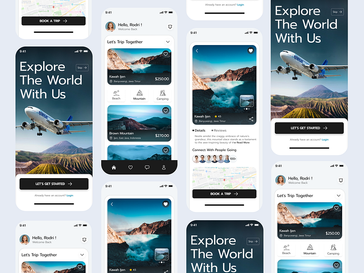
WeTravel 2.0 - Travel Mobile App UI
For the WeTravel 2.0 mobile app design, the goal was to reimagine a seamless and intuitive experience for users looking to book their dream vacations. The challenge in this case was to modernize the UI, making it not only visually appealing but also highly functional for a diverse audience ranging from solo travelers to families and groups.
To enhance user engagement, the app also incorporates a social feature where users can share their travel experiences, write reviews, and even get inspiration from others. Notifications are intelligently designed to provide useful updates, such as price drops or travel advisories, without overwhelming the user.
In terms of visual design, WeTravel 2.0 employs a modern color palette with vibrant accents that evoke a sense of adventure and excitement, while still maintaining a professional look. Subtle animations and micro-interactions give the app a polished feel, enhancing the user experience without distracting from functionality.
Let's chat 👋
or
nirobman100@gmail.com / facebook / WhatsApp: 01758235283
We are open for partnership to build your next awesome product


