Brand Identity: Satiate Luxe Case Study
Brand Identity: Satiate Luxe
After a series of re-branding since 2021, Satiate Luxe reached out to Flipbox to redefine its brand identity and distinguish it from other service providers.
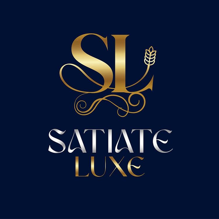
The Fllipbox Design team explored multiple concepts, considering various typography styles, ornamentation options, and visual elements. Each concept aimed to capture the essence of luxury, sophistication, and culinary excellence synonymous with the brand, the direction that aligns with the brand’s positioning strategy.
A classical script font was carefully selected to evoke elegance, refinement, and timeless sophistication. The script’s fluidity conveys a sense of indulgence and culinary artistry, while its ornate details add a touch of luxury.
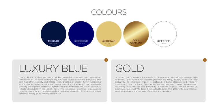
A sophisticated colour palette was chosen, comprising rich, indulgent hues that evoke luxury and refinement. Luxury blue or royal blue, complemented by accents of gold, add luxury and prestige to the logo design.
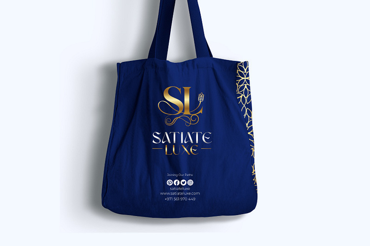
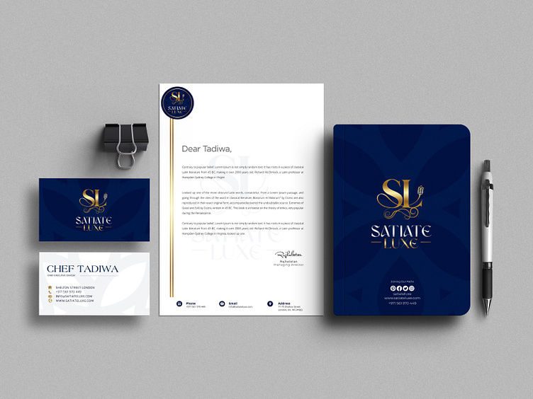
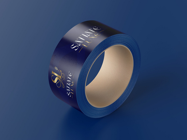
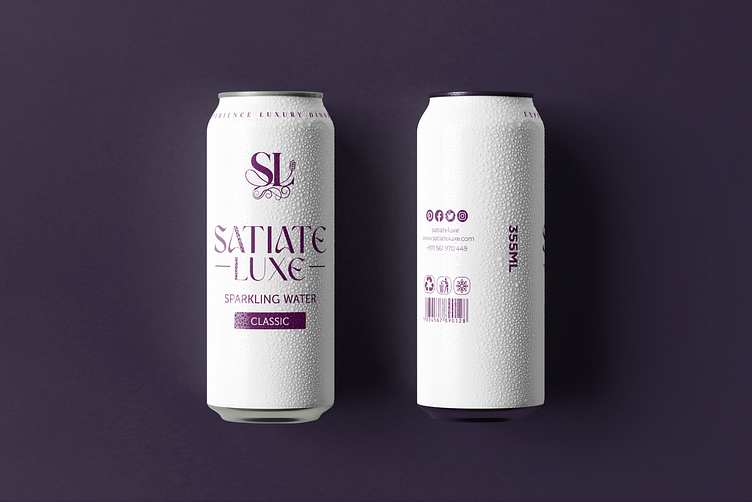
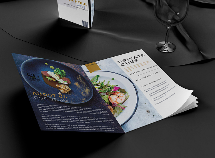
The final logo design was integrated across all brand touch points, including marketing collateral, packaging, digital assets, and physical spaces. The cohesive brand identity of “Satiate Lux” now communicates luxury, indulgence, and culinary excellence to its discerning clientele.
The branding was applied to all Satiate Luxe’s brand assets, including their official website.
