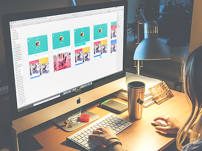
Case Study. Saily UI Design
Hi! Inspiring Friday to everyone!
Today is one more day for us to share ideas about design, so I am keen to do it with a new article in Tubik Blog. This time it is a case study continuing the big and bright story about work on redesign for Saily App. Recently we described the process of Saily logo design and today we are telling about UI design for the application accomplished by Tamara. The post is packed with examples of screens, illustrations and animations. Welcome to read, guys!
Saily App project was one of the cases which gave Tubik Studio team the chance to work on the application for the wide and diverse target audience, thinking over multiple functions and user-friendly entertaining style. It was a bright great challenge which studio designers were happy to meet! Good upcoming weekend to all of you!


