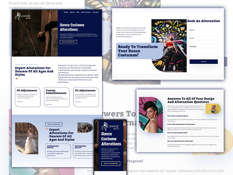
Dance Alterations - Concept Website Design
A Bold and Elegant Logo with a Dynamic Edge
The logo for the Dancewear Alteration Consultant blends elegance with a playful edge. Featuring a dancer line icon, the design captures the grace and fluidity of movement, while the bold, graffiti-inspired style adds a modern, urban touch. The bright and bold colour palette mirrors the energy and vibrancy of the dance world, creating a brand identity that is both eye-catching and professional. This unique combination ensures the brand stands out, resonating with both clients and the broader creative community.
High-Impact Design for an Engaging User Experience
The homepage of the Dancewear Alteration Consultant website is a high-impact visual experience that draws users in immediately. Featuring bold colours and large, striking images, the design showcases the artistry of dance and the skill involved in alterations. The layout is clean and easy to navigate, with simple content areas that make updates effortless. Subtle animations enhance the user experience without overwhelming, creating an engaging and mobile-friendly interface that caters to all devices, from smartphones to desktops.
This concept website was designed to capture the vibrant and energetic world of a dancewear alteration consultant. The goal was to create a bright, bold, and fun look with high-impact images and bold colours. I crafted a clean layout with simple content areas for easy updates. The logo design features a dancer line icon, blending an elegant yet graffiti-inspired feel to match the site's playful yet professional vibe. The end result is a visually striking, easy-to-navigate website.

