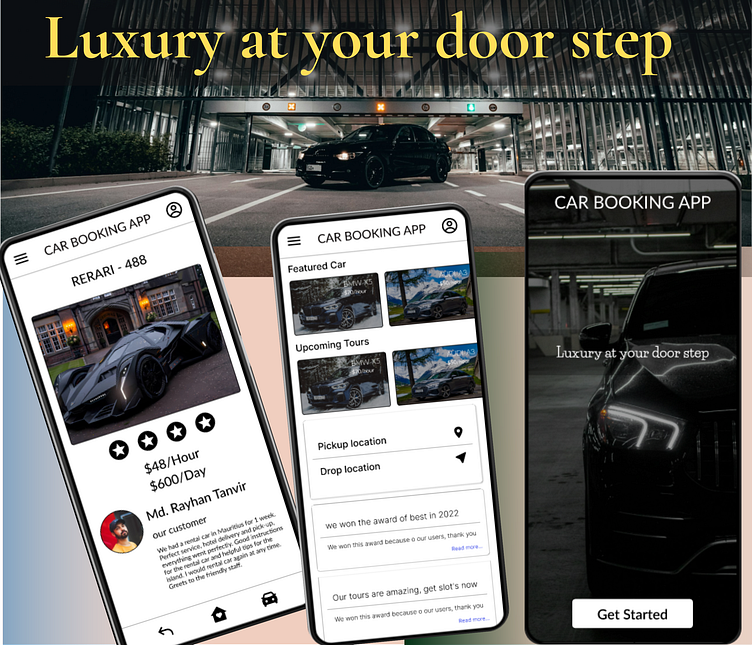
✨ Luxury Car Booking App Layouts ✨
I developed these three layouts as part of my practice during a free course on Udemy. Here's a brief overview of the design process, from scratch to prototype:
🟢 Step 1: Research & Ideation I started with research on user needs, identifying pain points for those looking to rent luxury cars. This helped shape the app’s features and user flow.
🟢 Step 2: Wireframing Using initial insights, I created low-fidelity wireframes to outline the layout and functionality, ensuring an intuitive user journey.
🟢 Step 3: UI Design After finalizing the wireframes, I designed three high-fidelity layouts, focusing on a clean, minimalistic aesthetic that enhances usability. The chosen color palette gives the app a modern and engaging feel.
Tools used: Figma, Photoshop, Freepik, Iconfinder, Canva.
If you have any feedback or suggestions, feel free to share in the comments! I'm always eager to learn and improve as a designer. 🙌
