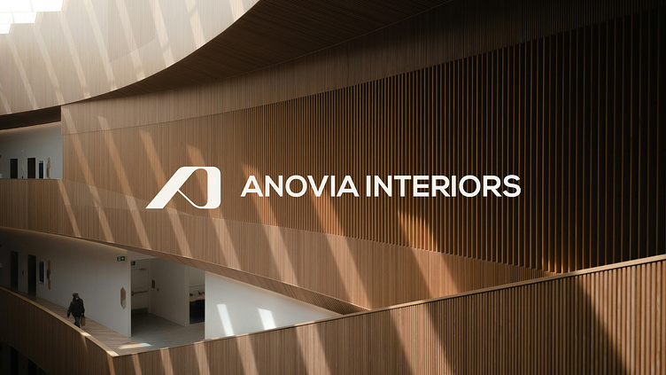
Anovia Interiors Branding
About the Company:
Anovia Interiors is an innovative interior design studio dedicated to transforming spaces into personalized, functional environments. Their design philosophy goes beyond aesthetics, focusing on sustainability and creating interiors that reflect each client’s unique story.
The Problem:
In a crowded market, Anovia Interiors needed a brand identity that differentiated them from competitors who relied on similar visual approaches. They sought a brand that was bold yet elegant, flexible enough to work across all platforms while embodying their values of thoughtful design and storytelling.
Our Solution:
We approached Anovia Interiors’ branding holistically, developing a complete identity system that captured their vision. At its core was a modern, minimal emblem—a unique "A"—symbolizing their refined yet bold approach. We crafted a versatile visual language that could be applied consistently across all touchpoints, from digital design to print materials.
To ensure their brand stood out, we selected "Red Blood" as the primary color, representing boldness and prestige, balanced by neutral tones like ivory, Timberwolf, and eerie black. This palette reflects both elegance and modernity, in line with Anovia’s commitment to timeless, high-end design.
We also developed a cohesive typography and layout system to enhance storytelling, offering creative flexibility and consistency across marketing materials, social media, and presentations.
Scope:
Brand Identity, Logo Design, Brand Style Guide, Color Scheme, Typography, Digital Design
Let's work together!
— Do you have a project? 📩 info@overoverdesign.com


