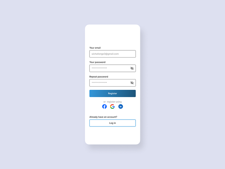
𝗥𝗲𝗴𝗶𝘀𝘁𝗿𝗮𝘁𝗶𝗼𝗻 𝗦𝗰𝗿𝗲𝗲𝗻
𝗗𝗮𝘆 𝟰/𝟵𝟬 – 𝗨𝗜 𝗗𝗲𝘀𝗶𝗴𝗻 𝗖𝗵𝗮𝗹𝗹𝗲𝗻𝗴𝗲: 𝗥𝗲𝗴𝗶𝘀𝘁𝗿𝗮𝘁𝗶𝗼𝗻 𝗦𝗰𝗿𝗲𝗲𝗻
The focus of today's challenge was to design a simple and clean registration screen with an option to log in if the user already has an account. 📲
🎯 Goals:
✅ Provide a smooth sign-up experience.
✅ Offer multiple sign-up methods (social login options included for convenience).
✅ Maintain a minimalistic and user-friendly design.
What are your thoughts on the balance between form elements and white space and overall design? Would love your feedback! 💬
hashtag#UIDesign hashtag#DailyUI hashtag#RegistrationScreen hashtag#UserExperience hashtag#UXDesign hashtag#MinimalUI hashtag#UIChallenge hashtag#DesignPractice hashtag#Figma
More by Ashraful Anwar View profile
Like
