Invoice app
Font Density
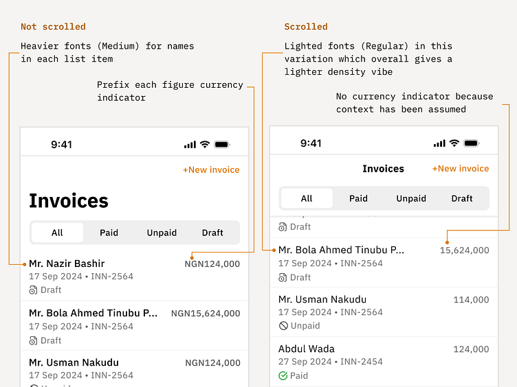
I've always found it more fascinating to use heavier fonts for all text in UI design because I've always felt it looked way better like that. However, during the design of this screen I noticed that, a heavier weight adds significantly to the visual density of the overall design. I have found that text variation in terms of hierarchy coupled with color variations are extremely powerful in establish a well structured and timeless design. Even though, this theory all depends on whether or not the app itself contains a lot of data or not, because if content is scanty on the app, then you'll be able to get away with much bigger and bolder fonts than if it were an app packing a lot of data.
Assuming context
I have noticed most apps likes to display the currency symbol of something before the text, which I have no problem with if it is an app that is used and viewed by different users coming from different parts of the world. However, in the case of this app, it's an invoice app that is created locally for the Nigerian business owner, so why bother clogging my screen real-estate. since they already know what currency they are dealing with?
[Inspired by Wechat]
Let me know what you guys think
