Data Analysis Design
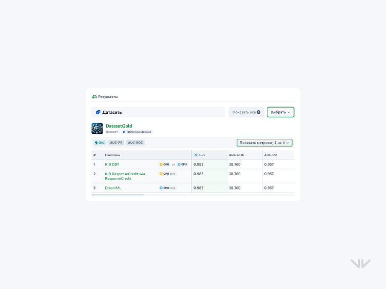
This interface displays the results of pipeline runs in a clear and organized table. The design simplifies the process of analyzing and comparing different machine learning models, highlighting key metrics.
Key features:
Metrics display: Important indicators such as Gini, AUC-ROC, and AUC-PR are visualized for easy comparison.
Compute resource options: Icons for "GPU" and "CPU" next to the pipelines help users quickly understand which resources are being used.
Tabular data: Neatly organized presentation of all pipelines with their performance and relevant metrics.
Sort and filter buttons: Interactive elements allow users to easily sort and select the necessary data.
Ideal for analytical platforms that require easy comparison and interpretation of ML model results.
---
Let's chat! hello@vonavivan.com
