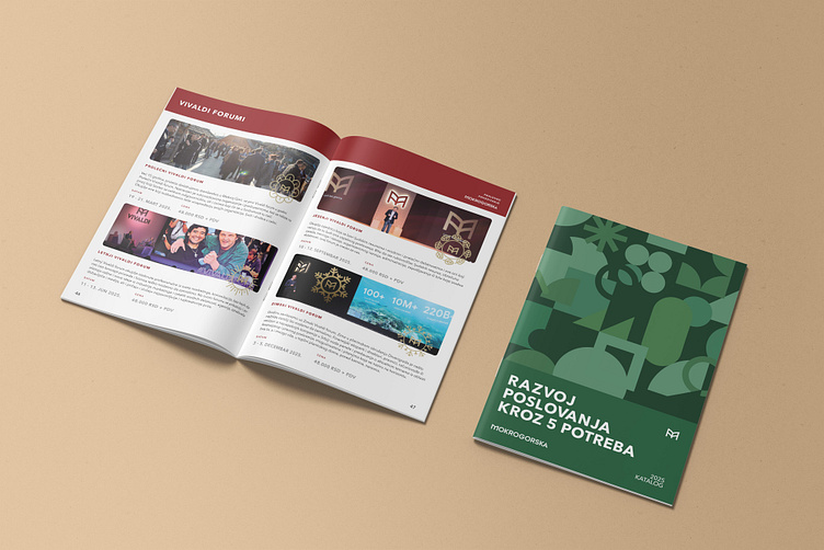
Business School Catalogue Design
Introduction
Mokrogorska Business School hired me to redesign its annual catalog, which is used to promote programs to students. The deadline was relatively short, and the project involved creating a detailed 64-page catalog.
Interviews
The catalog opens with interviews with the director and deputy director, providing a detailed overview of Mokrogorska Business School’s journey so far and their plans for 2025. These interviews were included to give readers immediate insight into the key individuals leading the school.
Their pages also feature signatures to enhance the sense of authenticity.
Testimonials
The content continues with statements from directors of other companies collaborating with Mokrogorska Business School. This section was included to provide social proof of the school’s reputation and features real photographs of these individuals, along with their names and titles.
Specialized programs
The main content of the catalog showcases the programs offered by the school to individuals and companies, aimed at developing specific skills and advancing careers.
Advanced programs
The content continues with programs designed for individuals in higher management positions, focusing on business development and training for those making the most critical career decisions. Since these programs are entirely separate from the previous specialized offerings, they are distinctly branded following the standards manual and differentiated by unique colors in the catalog.
Conclusion
This was a significant project that helped me enhance my skills in UX design and print. I’m grateful to the team at Mokrogorska Business School for trusting me with such an important part of their business year and allowing me to contribute to their new campaign.


