AdaMarie's identity and interface evolution

Project overview
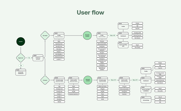
AdaMarie is a boutique job search platform and resource hub that connects women in STEM with businesses to diversify their workforce through a dynamic online platform.
It allows job seekers to build academic and professional profiles, search and view posted jobs, and gain access to career resources. Employers can build a company profile page, post jobs, and search and view potential candidates.
My role
UX Designer, responsible for creating and presenting design solutions to meet AdaMarie’s objectives, improving existing products, handing off designs to the engineering team, and performing quality assurance.

Business challenges
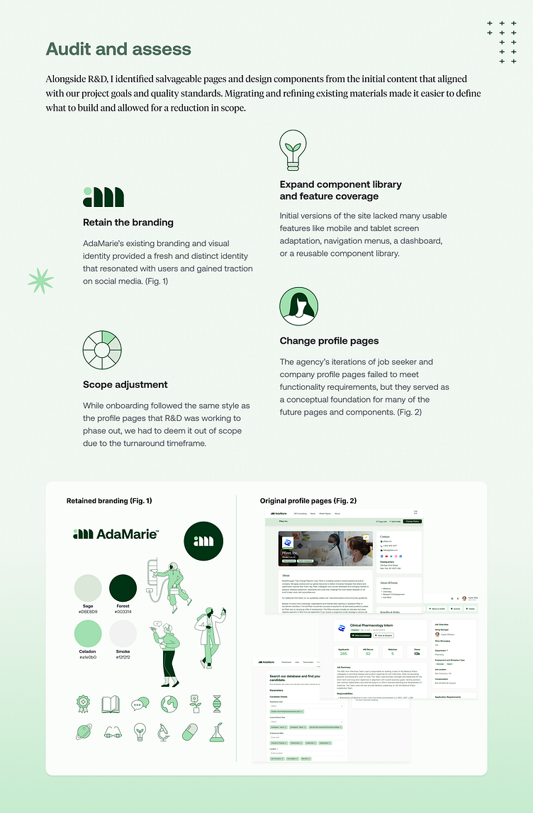
This case study examines the development of AdaMarie’s user profiles, job and candidate search, and dashboard. This involved reassessing and enhancing deliverables provided by a previous agency, then setting a foundation to build the framework and interfaces that could be passed off to developers.
Adapt existing content: Deliverable that did not fully align with user needs, quality standards, or business goals and wasn’t buildable for developers.
Appeal to target audiences: While the brand identity was strong, the interfaces didn’t appeal to key user demographics of young professional women in STEM.
Expedited turnaround: As part of R&D, I worked to bring the product from development to early access to meet a predetermined launch date.

Testing and development
As the app was in early access, we did most research and development in-house. I gained real world insights by collaborating with engineers and the product team to determine project effectiveness, feasibility, and scope.
Handle low data options for features
Demo versions for employers unveiled a late stage issue with user profiles and job forms with minimal information. I developed empty state graphics and prompts that encourage users to fill in missing information.
Reduce the number of screen sizes
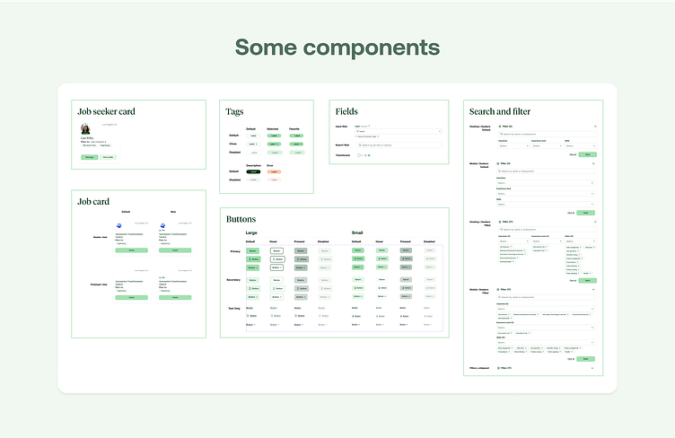
Early versions consisted of six screen sizes, as developers couldn’t address comprehensive responsiveness in the timeline provided. This resulted in visual inconsistency for users adjusting their window width. I condensed layouts to three sizes for the final version to improve development efficiency and ensure a consistent user experience across platforms.
Remove a user type
Original concepts for the app included a fourth user type, employees, who could link themselves to a company page. As I worked with R&D to align with short timelines, we found that employee site interactions were limited. We decreased the scope of employees, large companies and their unique structures, and administrative actions.
Key takeaways
Test, then test again
Without a live site or a survey of users, collaborating with engineers for quality assurance was the key to gaining insights, discovering design changes, and building ideas for future developments.
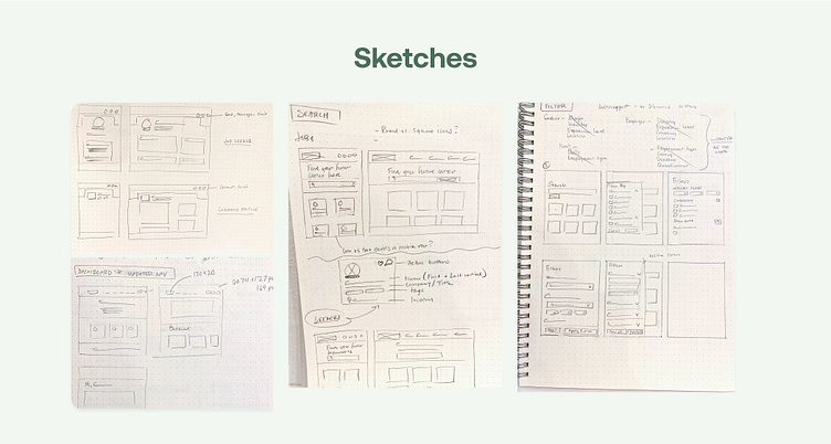
Map out user flows first
Shareholders pushed the development of profile and search pages as quickly as possible, and I started from the sketch and wireframe phase. Without a user flow to guide decision making, pages ultimately went through weeks of revisions during the development and testing phases. Submitting initial flows for review may have limited the number of overall revisions.
Future iterations
Due to the short turnaround, many initial concepts were deemed out of scope and slated for later release. Expanded versions of the AdaMarie site were slated to include:
Messaging: Facilitating communication between companies and job seekers in-app
Apply directly to jobs: Allowing job seekers to apply to a posted position without visiting an external site
Refresh onboarding: Creating a smoother onboarding experience by updating the original deliverables to match AdaMarie’s new website aesthetic.
Account settings: Managing site preferences, payment options, and privacy settings without having to reach out to support.
Animation: Introduce smart animation features to the existing character illustration library on loading screens.