LOLLA | LOGO DESIGN & BRAND IDENTITY
Lolla carries the mission of spreading joy, awakening childhood and bursting with sweetness in every candy! We don't just create candy - we create WOW moments, where every Lolla candy is a small adventure, full of color and surprise.
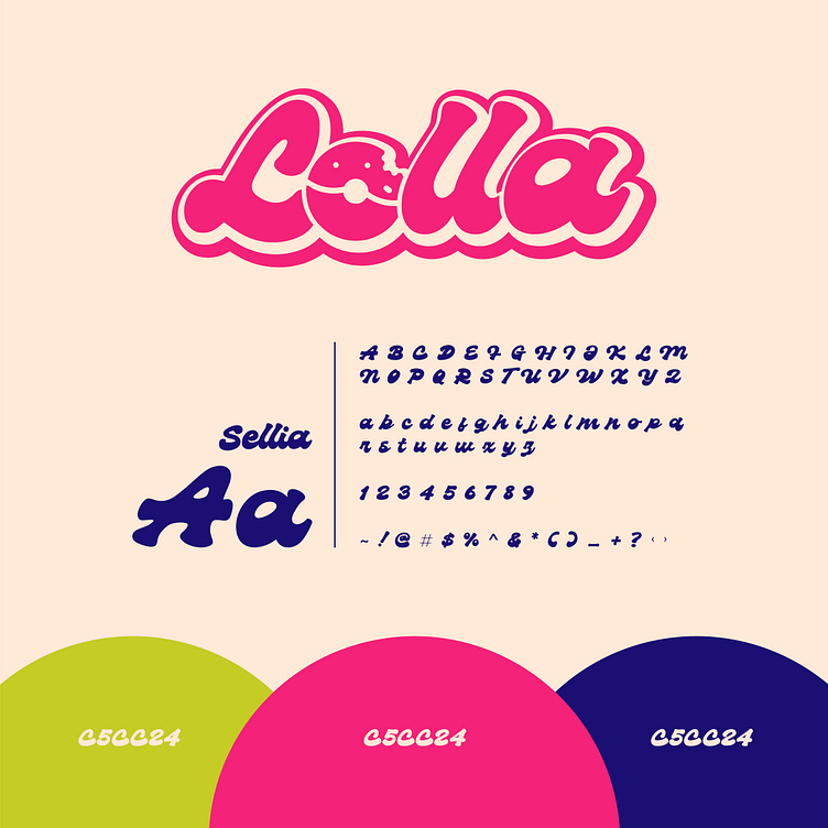
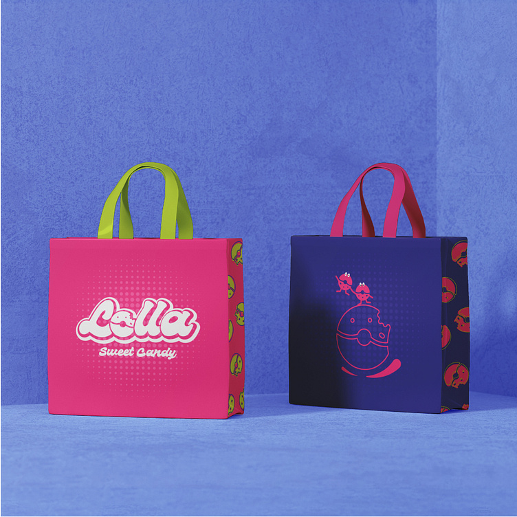
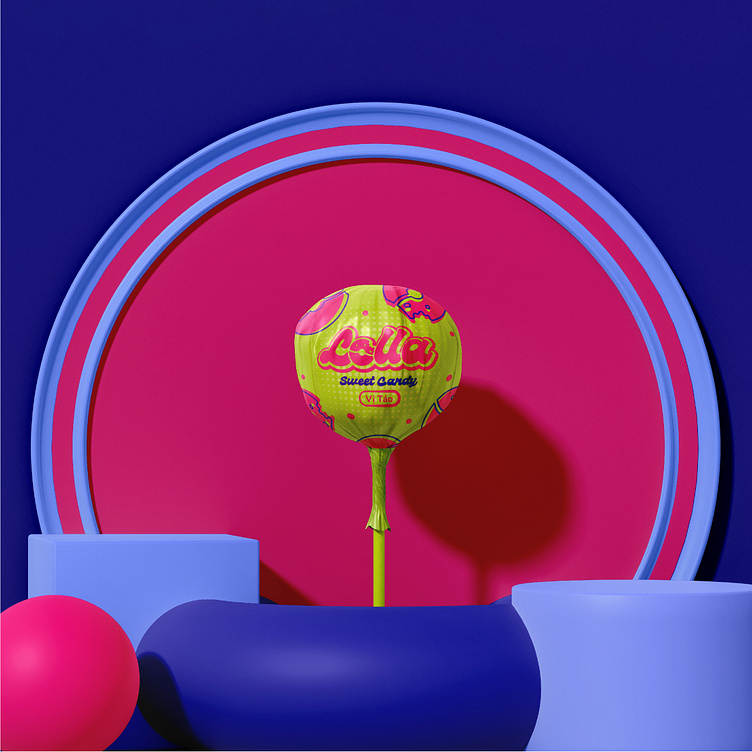
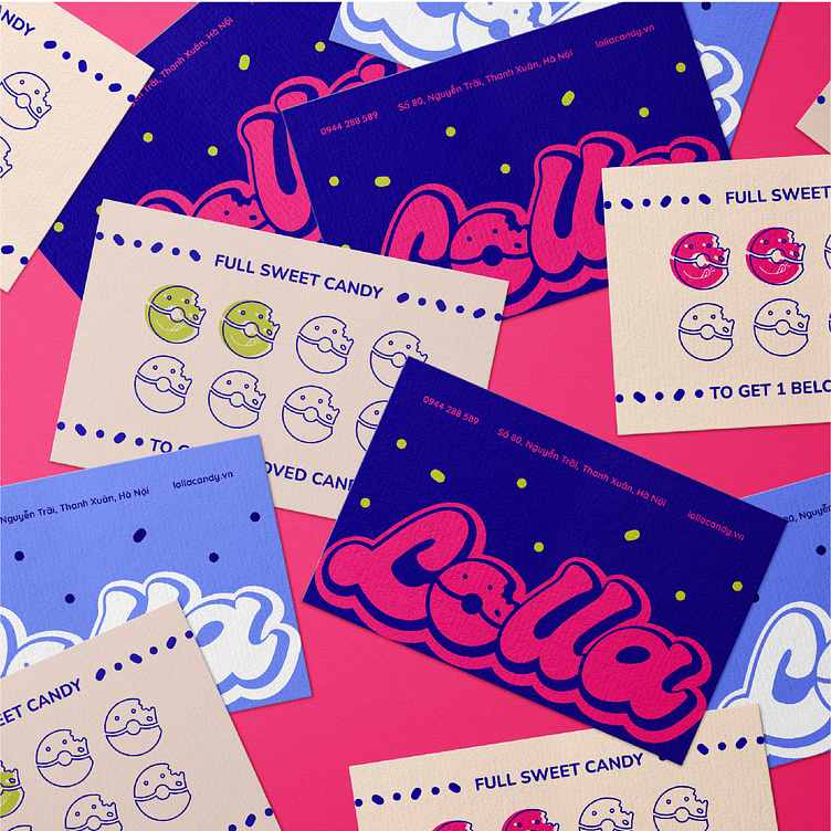
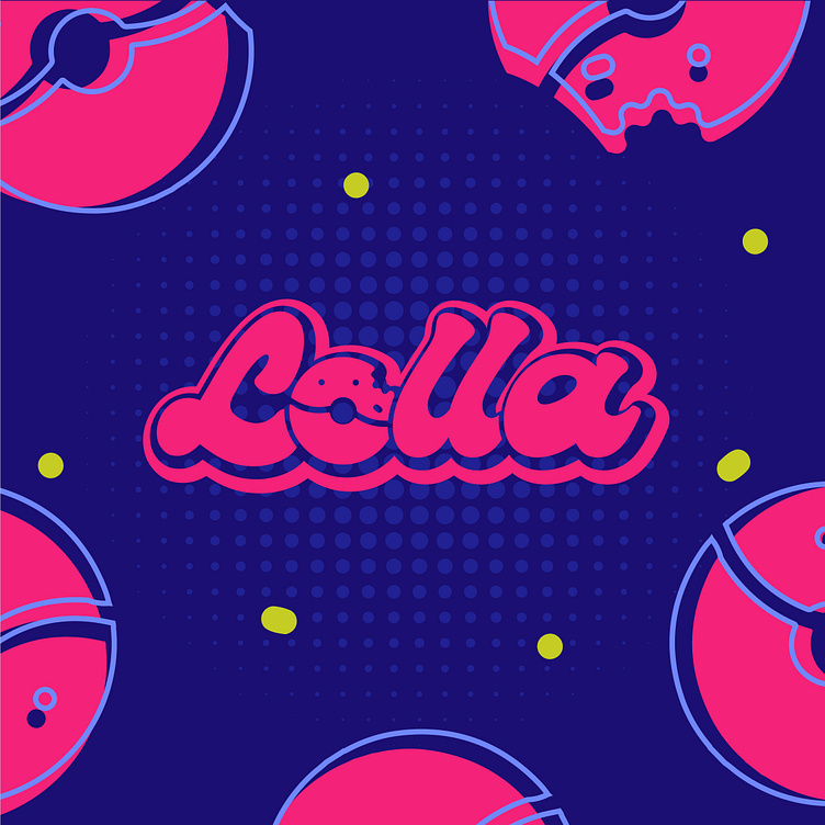
The Lolla brand identity is designed with a youthful, dynamic, and outstanding style, aiming to attract young customers, especially children and teenagers. Bee Art combines two strong contrasting colors: neon pink - bringing a sweet, playful feeling and dark blue - highlighting graphic and text elements, creating a clear contrast and making a strong impression at first sight.
The rounded font has a bit of influence from Pop Art, retro designs used in the logo, reminiscent of classic candy brands, but with a modern breath. This helps to combine nostalgia and dynamism, suitable for both children and adults who want to find childhood memories. The letter "O" in the logo is stylized by Bee Art into a Donut shape, a typical image of sweet products, helping customers easily associate with the products that the brand provides. A bitten Donut creates a delicious feeling and stimulates the taste buds, making viewers want to enjoy it immediately. Overall, the Lolla brand identity conveys a youthful, dynamic and sweet image, suitable for a fun sweet brand, while easily creating a strong impression on customers.
--
Designed by Bee Art
-
Client Lolla
Logo and Branding Project. Logo is designed for Beauty Spa in Vietnam.
Copyright © Bee Art. All Right Reserved
Contact us:
• Hotline/ Zalo: (+84) 77 34567 18
• Email: info@beeart.vn
• Website: www.beeart.vn
• Facebook: https://www.facebook.com/BeeArt.vn