Simple E-Commerce UI
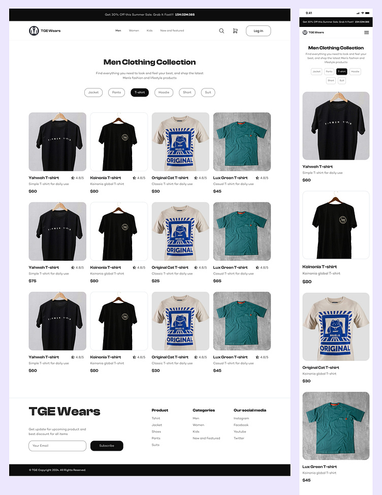
Minimalist E-commerce Store Home Screen
Designed with simplicity at its core, this home screen keeps things clean and easy to navigate. With large, high-quality images front and center, users can quickly find what they need. The layout is spacious, with plenty of white space to keep the focus on the products.
Bold, clean fonts for easy reading
Simple navigation bar at the top for quick access
Featured products highlighted to draw attention
A refreshing, no-fuss design that lets the products do the talking.
More by Michael Agboola View profile
Like
