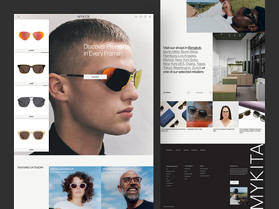
E-commerce Design Animation
Continuing the redesign journey, I’m integrating animation and parallax effects to bring depth and movement to the MYKITA website. The goal is to create a dynamic, immersive experience that draws users in while maintaining the brand’s minimalist elegance.
Thanks for checking it out!
Interested in partnering with us?
Or drop us a line:
hellodama@odama.io
Find more of our work on:
Website | Instagram | Behance | Creative Market | Gumroad
More by Odama View profile
Services by Happy Tri Milliarta
Like
