Restaurant Landing Page
Project Overview
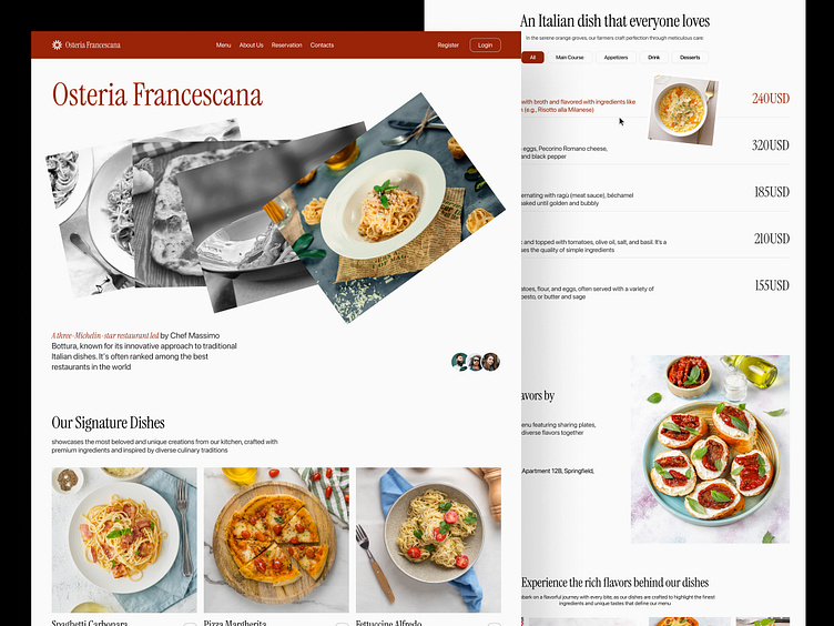
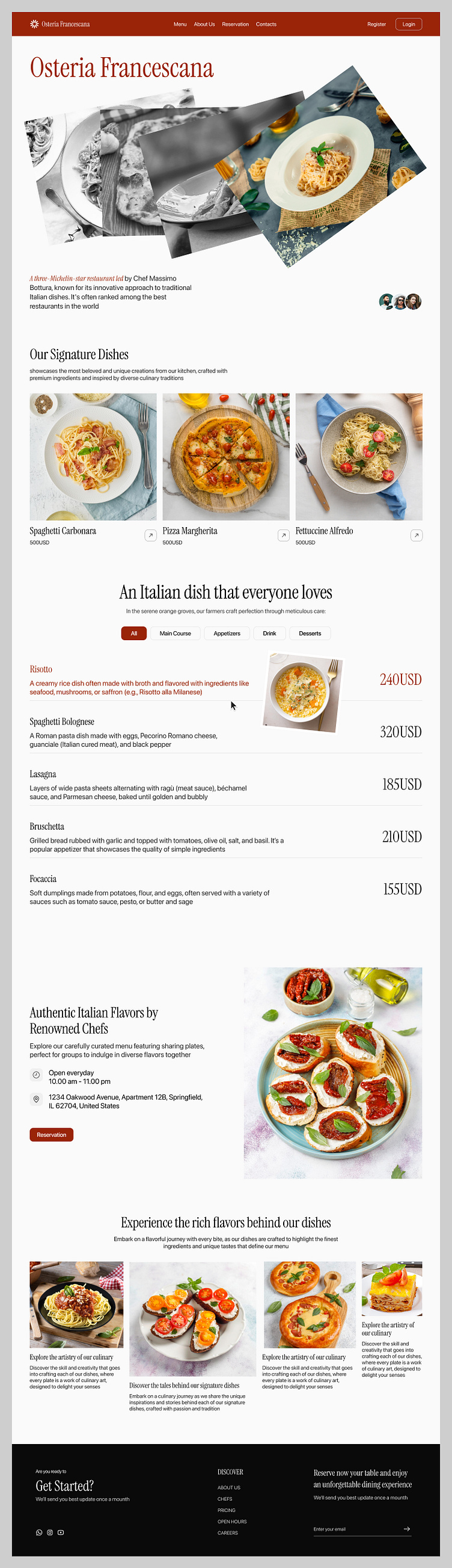
Objective: Design an elegant and functional restaurant website that reflects the sophistication of the three-Michelin-star restaurant, led by Chef Massimo Bottura.
Target Audience: Food connoisseurs, high-end diners, and individuals seeking unique culinary experiences.
Platform: Web (Desktop first)
Design Goals
The main goal was to create a seamless user experience with a focus on showcasing the restaurant's premium dining options, while also making the website user-friendly and visually captivating. Key aspects to consider:
Aesthetic appeal that reflects the restaurant’s luxury status.
Easy navigation to facilitate table reservations, menu exploration, and gathering information about the restaurant.
Highlight signature dishes and culinary experiences.
Design Process
Research & Conceptualization
Research: Analysis of luxury restaurant websites to understand common design patterns and usability aspects.
User personas: High-end diners, travelers, and local residents.
Key insights: Users expect both visual richness and functional ease, with a strong emphasis on food presentation and chef credibility.
Wireframing and Prototyping
A simple grid-based wireframe was used to structure the content.
High-fidelity prototypes were designed in Figma, with attention to imagery and text balance.
Color Scheme
Primary Colors: Deep red and white. The red color symbolizes luxury and passion, while white ensures clarity and minimalism.
Accent Colors: Soft grays for background elements, ensuring the focus remains on the content.
Contrast: The bold contrast between images and text helps create visual appeal while maintaining readability.
Typography
Primary Font: A serif font for headings adds a classic and refined look, perfect for the upscale nature of the restaurant.
Body Text: A clean, modern sans-serif font ensures that the content remains readable and contemporary.
Hierarchy: Headings and subheadings are well-structured, guiding the reader through different sections smoothly.
User Experience (UX)
Ease of Navigation: The navigation bar is clean, ensuring users can easily access any page without confusion.
CTA Buttons: The reservation button is prominently placed, making it easy for visitors to take action.
Information Flow: The layout ensures that users can scroll down naturally from introduction to menu, to chef’s stories, and finally to booking a reservation.
Let's collaborate with us
🛍️ Download our Premium UI Kit on
Follow our pages and join the journey
Instagram | LinkedIn | Behance