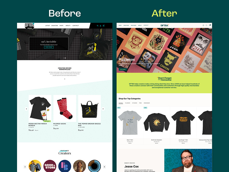
Redesign Comparison of Homepage ✦ DFTBA
We had the opportunity to redesign DFTBA's website on a brand new Shopify theme, focusing on both aesthetics and functionality. The goal was to provide a modern, elevated design that allows more customization and control for their team. By condensing templates into dynamic versions, we reduced admin management efforts while ensuring an intuitive user experience.
These two shots highlight a range of desktop and mobile designs, showcasing how we integrated visuals with CRO best practices. New branding from a partner agency also played a crucial role in balancing DFTBA's creative essence with optimal performance.
About Prismfly
Driving revenue for eCommerce brands through conversion rate optimization, full-stack development, branding, UI/UX design, and lifecycle marketing services.
learn more at www.prismfly.com
or reach us directly at contact@prismfly.com

