Great Job - Landing Page Website for a women's personal trainer
Landing Page Typography & Layout Choices:
When designing the landing page, I was intentional about maintaining a balanced and cohesive look by ensuring the font size wasn’t overly exaggerated. Instead, I focused on a subtle and refined type hierarchy that enhances readability without overwhelming the user. This delicate approach helps create a more approachable and user-friendly interface.
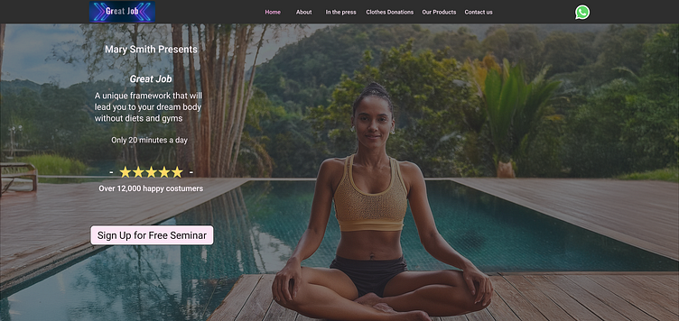
In the Hero Section, while I kept the overall font size consistent, I chose to slightly emphasize the headline to draw attention without breaking the subtle aesthetic established throughout the page. This provides a visual anchor for users as they begin their journey through the page.
Regarding text alignment, most of the content is left-aligned, following the F-pattern—a common reading pattern that enhances the user's scanning experience. This decision was rooted in research on user behavior and eye-tracking studies, ensuring that the content flows naturally and is easy to digest, improving overall readability and user engagement.
Banner Design & Animation Decisions:
The banner design includes a rightward movement effect, which adds an element of dynamic interaction. While the animation can’t be fully appreciated in a static image, the subtle motion was intentionally designed to catch the user's eye without being distracting. The smooth horizontal motion guides the viewer's attention in a natural way, encouraging exploration of the content.
In addition to the animation, I implemented a subtle visual effect to enhance the banner’s aesthetic. This was carefully chosen to add a polished, modern feel without overwhelming the user. The goal was to achieve a refined, professional look while maintaining a lightweight design that complements the rest of the page.
This balance between motion and visual styling enhances the overall user experience, making the banner both functional and visually appealing.
“About Me” Section: Layout & Interaction Design:
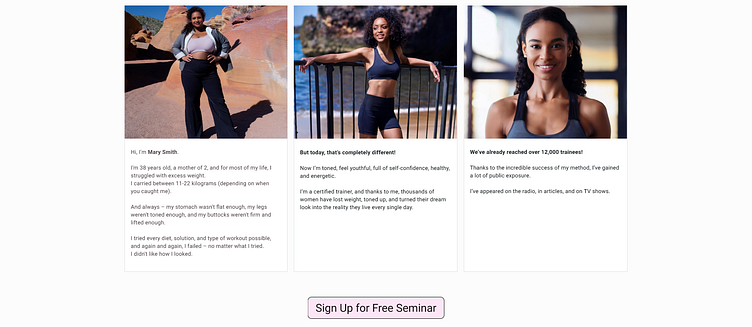
In the "About Me" section, I made a conscious decision to streamline the landing page by placing three images side by side, rather than stacking them vertically. This horizontal layout not only reduced the page’s length, but also created a more visually dynamic experience, allowing users to quickly scan key milestones or content without excessive scrolling.
Each image/milestone is housed in its own dedicated column, with clear separation between them to maintain visual clarity and balance. This grid layout enhances readability and ensures each piece of content stands out individually, preventing visual clutter.
To encourage user engagement, I placed the call-to-action button centrally, directly beneath the columns. This strategic placement creates a natural flow as users progress through the content, guiding them toward the action I want them to take without interrupting their journey.

Iconography & Visual Placement:
To represent the concept of donation, I selected an icon featuring two hands holding a heart, a widely recognized symbol for generosity and support. This choice reinforces the emotional connection users associate with charitable actions, adding visual context to the content.
The icon is strategically positioned above the text, aligning with the natural eye movement patterns based on the F-pattern. This placement ensures that the user's attention is drawn to the most important elements first, creating a seamless flow from the icon to the supporting text. By guiding the user's eyes in this way, the design enhances readability and reinforces the intended message effectively.
_____________________________________________________________________________________________________________________________________
This page was inspired by a job offer I received,
which ultimately did not come to fruition,
to redesign a landing page.
Here is the original page: https://lasttime.co.il/
