Dundle.Com: Checkout User Flow & UI Redesign Concept
🚀 Project Overview:
Thrilled to present my concept project for the Dundle.Com checkout user flow and UI design! This project aims to reimagine the checkout experience, making it more efficient, user-friendly, and visually appealing.
🎯 Objectives:
Simplify the checkout process to enhance user experience and reduce cart abandonment.
Create a visually cohesive design that aligns with Dundle.Com’s brand identity.
Incorporate best practices in UX/UI design to ensure a seamless flow from cart to purchase.
Introduction to the Problem
In today’s digital landscape, where gift cards serve as popular purchasing options for a myriad of consumers, the ease of transactions plays a crucial role in user satisfaction. Dundle.com, a digital marketplace for gift cards, unfortunately struggles with various usability issues in its checkout flow. Having no account creation feature, an unnecessarily lengthy process involving a delivery stage, poorly organized payment options, and unclear error handling, Dundle.com presents significant friction points that could deter potential customers. A redesign of its checkout process not only promises to enhance user experience but also ensures higher purchase rates and customer retention.
🛠️ Key Features:
Optimized User Flow: Redesigned the checkout steps to minimize friction and streamline the purchasing process.
Responsive Design: Ensured a consistent and optimized experience across all devices, from desktops to mobile phones.
Modern Aesthetics: Updated the UI with a clean and modern look.
Trust Indicators: Added clear security badges and trust signals to build user confidence during the checkout process.
Usability Issues: Identification
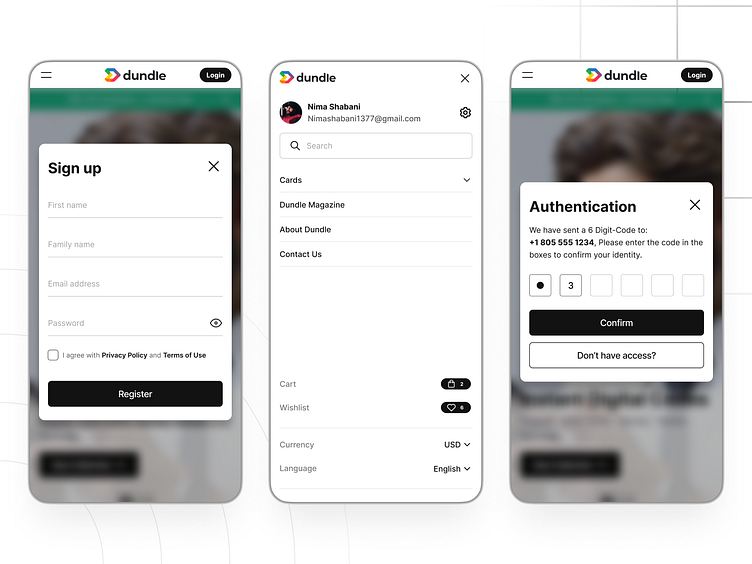
Lack of Account Creation: Users are currently deprived of a secure account option where gift card codes are stored. Instead, codes are sent via email, which presents a significant risk. If users input an incorrect email or lose access to their email accounts, their purchases are jeopardized. Not to mention, many transactions are processed as "fraud" due to the absence of an account verification process, potentially leading to wrongfully suspended buyers.
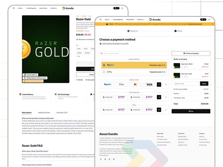
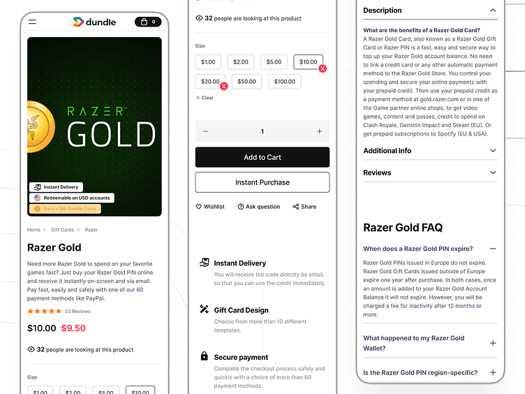
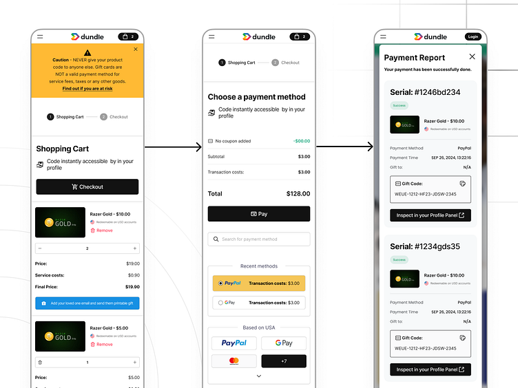
Unnecessary Delivery Stage: The checkout process currently consists of three stages: shopping cart, delivery, and checkout. For digital gift cards, the delivery stage is redundant. All necessary information, including payment method and recipient email, can be captured in a single streamlined checkout page, boosting efficiency and user satisfaction.
Disorganized Payment Options: While Dundle.com offers a whopping 61 payment methods catering to a diverse range of users, the lack of organization makes it challenging for customers to find suitable options. Categorizing these methods based on country, currency, transaction costs, and success rates would enhance usability.
Usability Issues: Resolution
In response to these usability issues, I propose a succinct and efficient checkout process composed of two streamlined stages: the shopping cart and checkout. Here's how these changes will be structured:
User Account Creation: An account creation feature will be integrated, emphasizing high security. Users will set up unique credentials and store gift card codes directly in their accounts. This provides a safeguard against lost access to email and significantly reduces fraudulent flags during purchases.
Two-Stage Checkout Process: The checkout flow will comprise only two stages. The shopping cart will easily lead to a checkout page that captures all necessary personal and payment information at once. This optimization will reduce the total time spent on the checkout process and increase conversion rates.
Organized Payment Options: Payment methods will be categorized by users' location using IP tracking to present only relevant options. This segmentation will extend to additional filters, such as currency and transaction fees, making their choice more straightforward.
Clear Error Messaging: An overhaul of error messaging will offer users precise information about what went wrong, including suggested remedies. This transparency will help reduce customer frustration and enhance trust in the platform.
Email Notification Optimization: Efforts should be made to improve the system for recognizing various email providers, ensuring users receive timely confirmations without repeated input.
📈 Expected Outcomes:
Improved Conversion Rates: A more intuitive and streamlined checkout process is expected to reduce cart abandonment and increase completed purchases.
Positive User Feedback: Anticipating positive responses from users for the simplicity and ease of use of the new design.