Case Study MySavvyBookkeepers – Custom UI
Imagine you’re a business owner in Canada, juggling multiple tasks, from managing operations to keeping clients happy. Amidst all this chaos, staying on top of your finances can be a real headache. That’s where bookkeeping services swoop in to rescue you.
Outsourcing this crucial task frees up valuable time to focus on growing your business and gaining access to expert financial management. This can help you make smarter decisions and ultimately save you a lot of money in the long run.
This way, our client, MySavvyBookkeepers, offers stress-free bookkeeping and payroll services designed for busy entrepreneurs across Canada. However, before they met us, they were struggling with a website design that did not resonate with their business identity.
That is how MySavvyBookkeepers met Seahawk for a custom UI and Figma to WordPress project. The client’s primary requirement and goal was to design a website UI according to her business and services. With that in mind, we designed a website that displayed the true essence of their services and brand.
Lee’s see how we did it: -Project Overview
Yan, the founder of My Savvy Bookkeepers, came to us looking to refresh her service-based website. Her goal was simple: to have a website that truly represented her business and made it easy for clients to understand the services she offered.
With a clear vision in mind, we decided to build the site using a custom UI design in Figma and develop it on WordPress. Let’s have a quick glance at the project details:
Website: MySavvyBookkeepers
Project Duration: 2 months
Location: Canada
Service: Bookkeeping and Payroll
Requirement: Figma to WordPress (Custom UI)
Problem Statement
Let’s begin by understanding the project problem statement. When the client initially approached us, her website didn’t fully reflect the professional image she wanted for her bookkeeping business. The layout was outdated, and the user experience wasn’t optimized for her target audience. She needed a design that would not only look polished but also communicate her services clearly and intuitively.
Additionally, the website lacked the seamless functionality required for a growing service-based business and to manage its service offerings more effectively.
Thus, the main concern was aligning the website’s UI with the core values of her business while providing a smooth experience for potential clients.
Our Approach & Solution
Enter your text here...To solve the issues the client was facing, we focused on two main goals: giving her website a fresh new look and making sure it was easy for her clients to navigate. Here’s how we tackled it:
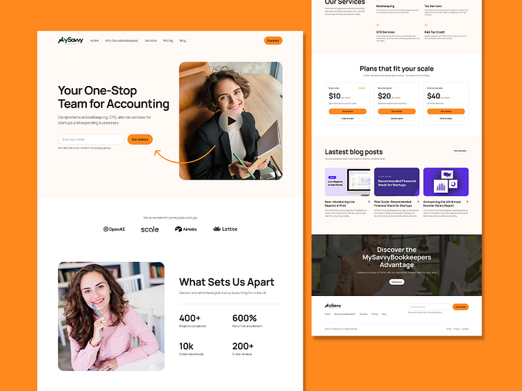
Custom UI Design: We started by creating a completely new design using Figma, focusing on making the website look polished and professional. The client’s business is all about trust and clarity, so we made sure the design reflected that. The layout was kept clean and simple, making it easy for visitors to find the information they needed and get a feel for her services.
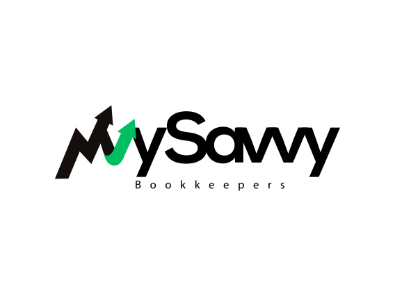
Logo Design: In addition to redesigning the website, we also created a custom logo for My Savvy Bookkeepers. The idea was to craft something that not only matched the fresh look of the site but also gave the client’s brand a unique and professional identity. The logo really helped bring everything together, making the overall branding feel consistent and cohesive. The design is also part of Brandy’s style guide.
Enhanced User Experience: Beyond just looks, we wanted the website to work smoothly for anyone visiting. We reorganized the structure of the site so that potential clients could easily explore the services Yan offers. Clear and intuitive navigation was key, ensuring that everything from understanding the services to contacting Yan was as seamless as possible.
Our Process
Designing the client’s website was a collaborative effort, and every step was taken with her vision in mind. Here’s how we went about it:
Intake and Initial Design
We kicked things off by sitting down with the client to really understand what she wanted from her website. She shared her goals, her target audience, and the kind of experience she wanted her clients to have. Armed with these insights, we got to work on a custom design in Figma. It was all about creating something clean, professional, and easy to navigate. The client was hands-on throughout, giving us feedback and helping fine-tune the design until it felt just right.
Development on Staging
Once the design was signed off, we moved into the development phase. Instead of working on the live site, we built everything on a staging environment, which allowed us to experiment without disrupting the existing site. This also gave client the chance to see her new site come to life in real-time. As we translated the Figma design into a WordPress site, we made sure every detail was pixel-perfect, keeping everything true to the original design.
Subpage Development
With the homepage in place, we extended the design across the site, developing subpages like the services and contact pages. Each one was crafted to ensure consistency so visitors could easily find what they were looking for, no matter where they were on the site. We kept checking in with the client during this phase to make sure the subpages were on point and matched her expectations.
Final Approval and QA
Before going live, we did a thorough quality check. We tested the site on all kinds of devices and browsers to ensure it worked smoothly everywhere. Once everything was polished and the client gave the final green light, we made the website live on her server. It was exciting to see all the work come together in a site that truly reflected her business.
Final Outcome
The updated website turned out exactly how the client wanted it. By focusing on updating the layout UI, we gave the site a clean, modern look that made it much easier for her clients to understand her services.
The new design wasn’t just about looks; it helped improve the overall user experience, making it simple for visitors to navigate and find the information they needed. The site now feels much more professional and user-friendly, perfectly matching MySavvyBookkeeper’s needs.
Wrapping Up
Working with MySavvyBookkeepers client to redesign her website was a great experience. By focusing on updating the layout, we were able to create a site that not only looked fresh but also worked better for her clients.
The project helped improve the overall user experience and gave her business a more polished online presence. We’re excited to see how this new design helps her grow, and we’re happy to have been part of this journey