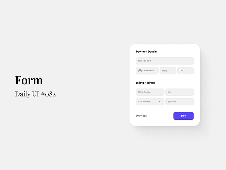
Form - Daily UI #082
Level up your checkout experience with seamless and modern UI!
🎯 Why This Matters: Creating a frictionless user experience for payment forms is crucial for increasing conversions. This clean, minimal design focuses on clarity and ease of use, ensuring every interaction is smooth and intuitive for users.
💡 Key Features:
Simple and Organized Layout: Separate sections for card and address details make filling out the form less overwhelming.
Clear Call to Action: The bold “Pay” button ensures the user knows exactly what to do next.
Subtle Modern Touches: Rounded corners and soft shadows create a friendly and approachable feel, perfect for any modern web or mobile interface.
🔗 Let’s connect if you're looking for fresh, intuitive UI solutions that elevate your user experience. Whether you need a custom design or want to collaborate, I’m open to new projects!
👉 Follow for more UI insights or drop a message to discuss your design needs!
------------------------------------------------------------------------------------------------------------
Let's talk and Collaborate:
