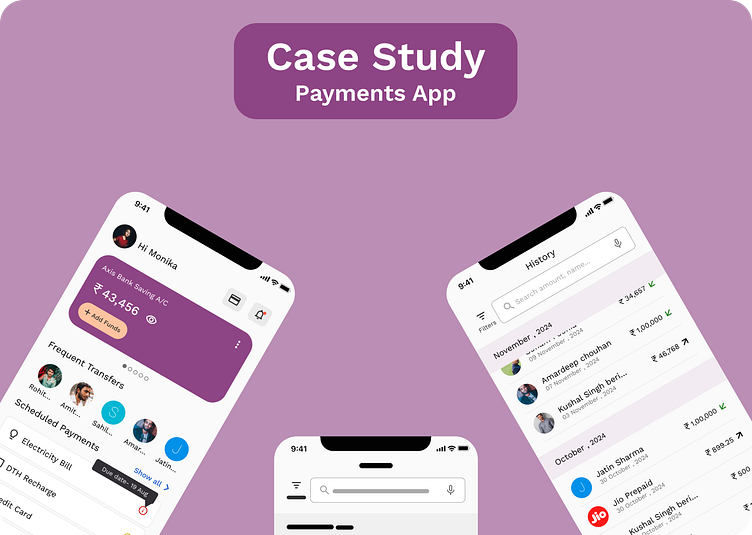
"Case Study" - Payments App
Overview
The Payments App is crafted to make managing your money simple and efficient. It provides a straightforward way to handle transactions and keep track of your financial activities, all from one convenient platform.
Key Features:
Send and Receive Money: Transfer or accept payments quickly and easily, whether paying for services or receiving money from others.
Multiple Transfer Options: Send money using various methods, including bank transfers, mobile numbers, and UPI, giving you flexibility for any situation.
Recharge Services: Top up mobile phones or pay for other services directly through the app.
Track Transactions: Access and manage your transaction history with a user-friendly interface, keeping everything organized.
The Payments App combines ease of use with robust security, ensuring your financial transactions are both smooth and protected. It’s the ideal tool for those looking to manage their payments with confidence and simplicity.
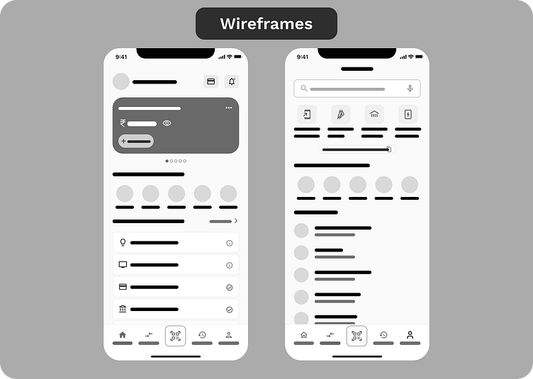
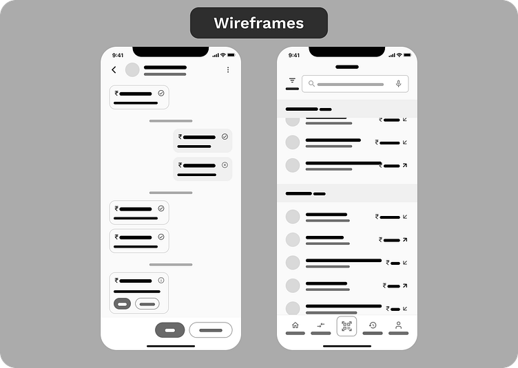
Wireframes
By generating these wireframes, I was able to visually map out the app’s functionality, key features, and user interactions. This process gave me a clear understanding of how users would navigate the app and interact with its core functions. It was a crucial step before diving into the main screen design, as it allowed me to make informed decisions, identify any challenges, and refine the user experience early on. This approach ultimately saved time and effort, ensuring that the app’s structure was solid from the beginning.
UI Screens
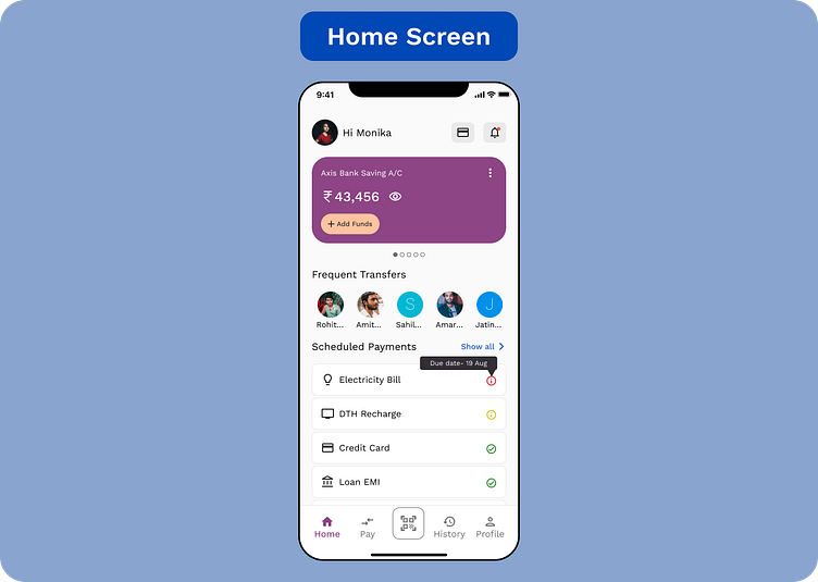
Home screen
The home screen serves as the central hub, allowing users to navigate through various features of the app. At the top, there's a card displaying the user's available balance in their linked bank account, along with an "Add Funds" button for quick top-ups. Below that, a horizontal list of frequently contacted individuals is provided for easy and quick money transfers.
Next, users will see a list of upcoming scheduled payments, with a tooltip indicating if immediate action is required, making it easy to stay on top of important bills. Finally, the navigation bar at the bottom includes a larger QR code scanner button in the center, ensuring users can easily find it and make payments directly from the home screen.
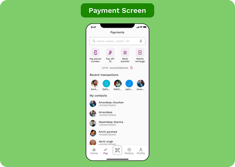
Payment screen
When the user wants to transfer money through different methods too, they’ll interact with this screen. At the top, there’s a search bar where they can look up people by name, UPI ID, or phone number. Below that, I’ve added various options for sending money and an option for mobile recharges.
Next, users will see a horizontal list of their recent transactions for quick access. After that, the contact list is displayed, allowing users to browse through their contacts or simply use the search bar at the top for easier navigation.
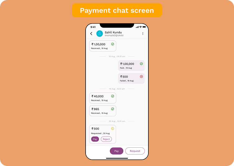
Payments chat screen
When the user taps on the profile of the person they want to send money to, the payments chat screen opens, displaying all previous transactions between them. From here, the user can pay that person directly by tapping the "Pay" button, or request money by tapping the ghost button labeled "Request."
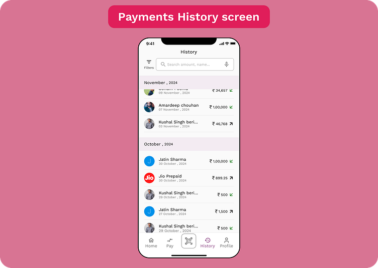
Payments history screen
When the user wants to check all their previous transactions, they’ll use this screen. At the top, there’s a search bar where they can look up any specific transaction. There’s also a filter icon that lets the user sort transactions by dates, bank accounts, and more.
Below, the transactions are organized month-wise, with the month title staying sticky at the top as the user scrolls through the list, updating automatically based on the current position.
Hello Dribbblers!
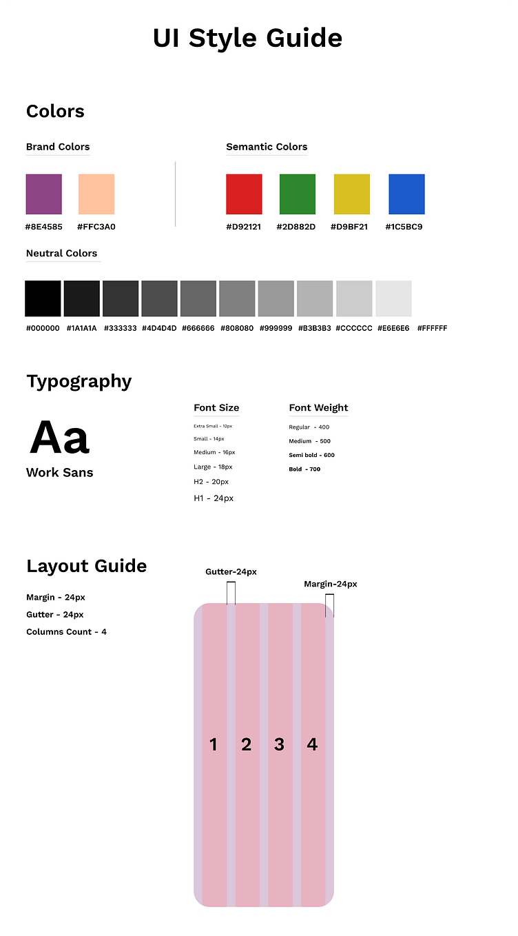
I’m excited to share my latest project with you. This showcases the design journey of my payment app, starting from wireframes to the final color and typography choices. I would love to hear your valuable feedback and any suggestions you might have for further improvements.
If you enjoy this project, please show your support by liking and commenting.
Thank you for your time!
