Elaichi Restaurant Brand Guideline Overview
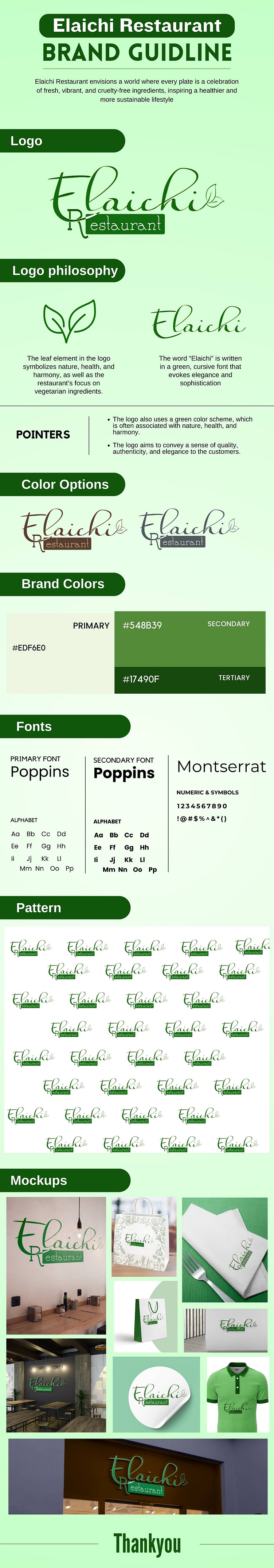
Elaichi Restaurant Brand Guideline Overview
Brand Vision:
Elaichi Restaurant envisions a world where every plate is a celebration of fresh, vibrant, and cruelty-free ingredients, inspiring a healthier and more sustainable lifestyle.
Logo Design:
The logo integrates a stylized leaf element, symbolizing nature, health, and harmony.
The logo uses a flowing, script font for "Elaichi" paired with a more straightforward font for "Restaurant," conveying a sense of quality, authenticity, and elegance.
Logo Philosophy:
The word "Elaichi" is written in a cursive font that evokes elegance and sophistication, reflecting the restaurant's focus on high-quality dining experiences.
The green color in the logo symbolizes the restaurant’s commitment to health and nature.
Color Palette:
Primary Color: #548B39 - a rich green, symbolizing vitality and growth.
Secondary Color: #EDF6E0 - a light cream, providing a fresh, clean background.
Tertiary Color: #17490F - a deep green, used for accents and emphasis.
Typography:
Primary and Secondary Font: Poppins - Modern and versatile, used for readability and contemporary appeal.
Tertiary Font: Montserrat - Stylish and geometric, used for headings and impactful statements.
Patterns and Mockups:
A repeating pattern of the logo is showcased, suitable for various applications like wallpapers, packaging, or textile prints.
Mockups include restaurant merchandise like bags, napkins, interior signage, and staff uniforms, demonstrating the brand's comprehensive visual identity across all customer touchpoints.
Application in Physical Space:
The image displays how the branding is applied in physical locations, such as the restaurant's interior design, signage, and menu presentation, ensuring a cohesive and immersive brand experience.
