Carre Saint-Cyr - soft rebrand
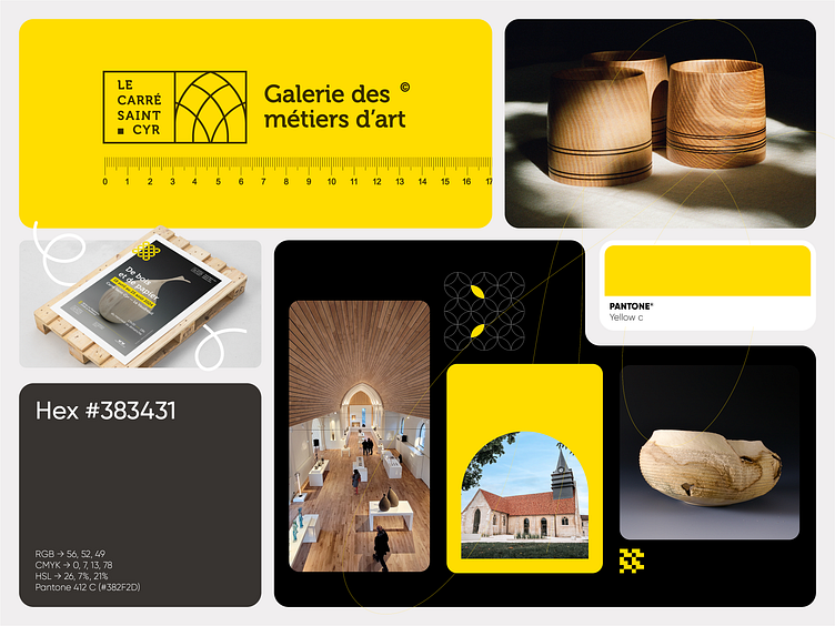
The visual identity for "Le Carré Saint Cyr - Galerie des métiers d'art" elegantly combines modern aesthetics with traditional craftsmanship. The logo, featuring a minimalist design in black and white, reflects the gallery's dedication to the arts. The intersecting arches symbolize the fusion of different artistic disciplines housed within the gallery.
The design language is further enriched by the use of geometric patterns, where black and white shapes interact dynamically, with occasional touches of Pantone Yellow C. This bright yellow accent not only adds a pop of color but also embodies creativity and energy, making the identity both striking and memorable.
A series of custom icons has been developed, each representing different crafts and arts showcased in the gallery. These icons maintain the geometric theme and are designed to be simple yet distinctive, ensuring they communicate effectively while remaining cohesive with the overall visual identity.
The identity is versatile, seen in the careful selection of photography and imagery that highlights the craftsmanship of the gallery's artisans. The imagery, paired with the identity’s modern design, communicates a blend of tradition and innovation, aligning with the gallery's mission.
This visual identity, with its clean lines, geometric patterns, and bold color choices, effectively conveys the spirit of "Le Carré Saint Cyr" as a contemporary yet timeless institution dedicated to the celebration of the arts.


