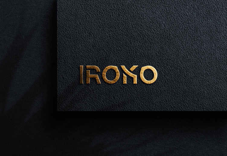
IROKO (LOGO DESIGN)
As IROKO is a furniture brand, I search and research the world's most famous furniture companies and their brand logos, as well as Bangladeshi brands. I made the decision to create a unique wordmark with a logical expression that relates to the furniture business. My main motto is to cut the letters according to furniture shapes, so I think about every letter that makes the word IROKO. Firstly, I cut a smooth curve on the middle point of the I letter, which is used to design furniture. Then I designed R based on the traditional chair, which is referred to as the traditional single chair that is familiar to the people of our region. IROKO word has two O, I make it a logical and symphonic move. The O letter is designed according to the modern swing. The first one is the position of the starter move, which is to make the swing swing, so that the hanging point of the swing is placed on the right side. The letter K is designed according to the shape of a modern chair, which is unique as well as modern. It has a great impression of style and comfortability. The last letter is O, which is also designed according to the swing, but its design is according to the last step of swinging. So the hanging point is placed on the left corner of the O shape. All over that, the final wordmark makes an impression of innovation and the modern syntax of furniture. So it's a really great idea to make the wordmark an icon for the brand too. Or make a word from the typography that I make—R, O, K—that anyone can use for the icon. I will show it particularly here. Here Please check the concept in the sketch that I gave for the logo.


