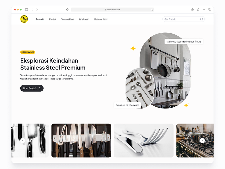
Canary - Website
We’re excited to introduce our latest project: the Canary Landing Page!
The Canary project was all about developing an engaging and comprehensive landing page for Canary, a company specializing in premium kitchen products. Our main goal was to create a user-friendly and visually appealing platform that highlights Canary’s unique offerings and provides detailed information about their range of kitchen essentials, including woks, bowls, and other kitchen must-haves.
We focused on delivering a seamless user experience with intuitive navigation and a streamlined purchasing process. The landing page showcases Canary’s brand identity and ensures that potential customers have all the information they need to make informed decisions.
Check out the design and let us know what you think! Don't forget to save and share!
Work Flow
Visual Design
Wdyt?
Leave comments & Love for sure! 🙌
For work inquiry please contact


