EdTech Company Branding and Logo #DailyUI - Day 5


STUDUP: The name STUDUP merges "study" and "up," indicating the platform’s mission to help students in their educational journey and find the right learning environments to excel.
In summary, this logo encapsulates STUDUP's mission to guide and support families in finding educational resources, while its vibrant color palette and clear symbolism create a visually appealing and meaningful brand identity.


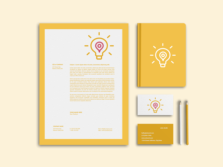
Light Bulb Symbol: The use of a light bulb in the logo represents education, enlightenment, and ideas. The light bulb has long been associated with learning, problem-solving, and innovation, making it a fitting symbol for an edutech platform. It emphasizes the role of STUDUP in providing students with the tools and knowledge to grow academically.
GPS Component Inside the Light Bulb: The GPS element inside the light bulb signifies the platform’s functionality of helping people locate nearby tuitions, schools, and colleges. This feature is particularly relevant for families who are new to a city and need assistance finding educational resources for their children. It highlights the idea of guidance and navigation, symbolizing how STUDUP helps users find educational opportunities.
Color Scheme:
D5536D (Deep Pink/Crimson): This bold and vibrant color evokes energy, action, and passion, making it a strong choice for a platform focused on education. It grabs attention and gives the brand a modern and approachable feel.
EFB11D (Golden Yellow): This warm, optimistic color complements the pink and represents knowledge, growth, and positivity. It enhances the theme of education by conveying enlightenment and success.


While it's only the starting point, I’m determined to turn this vision into reality and make this long-held dream come true.
Made with love by Kartikey Sengar!