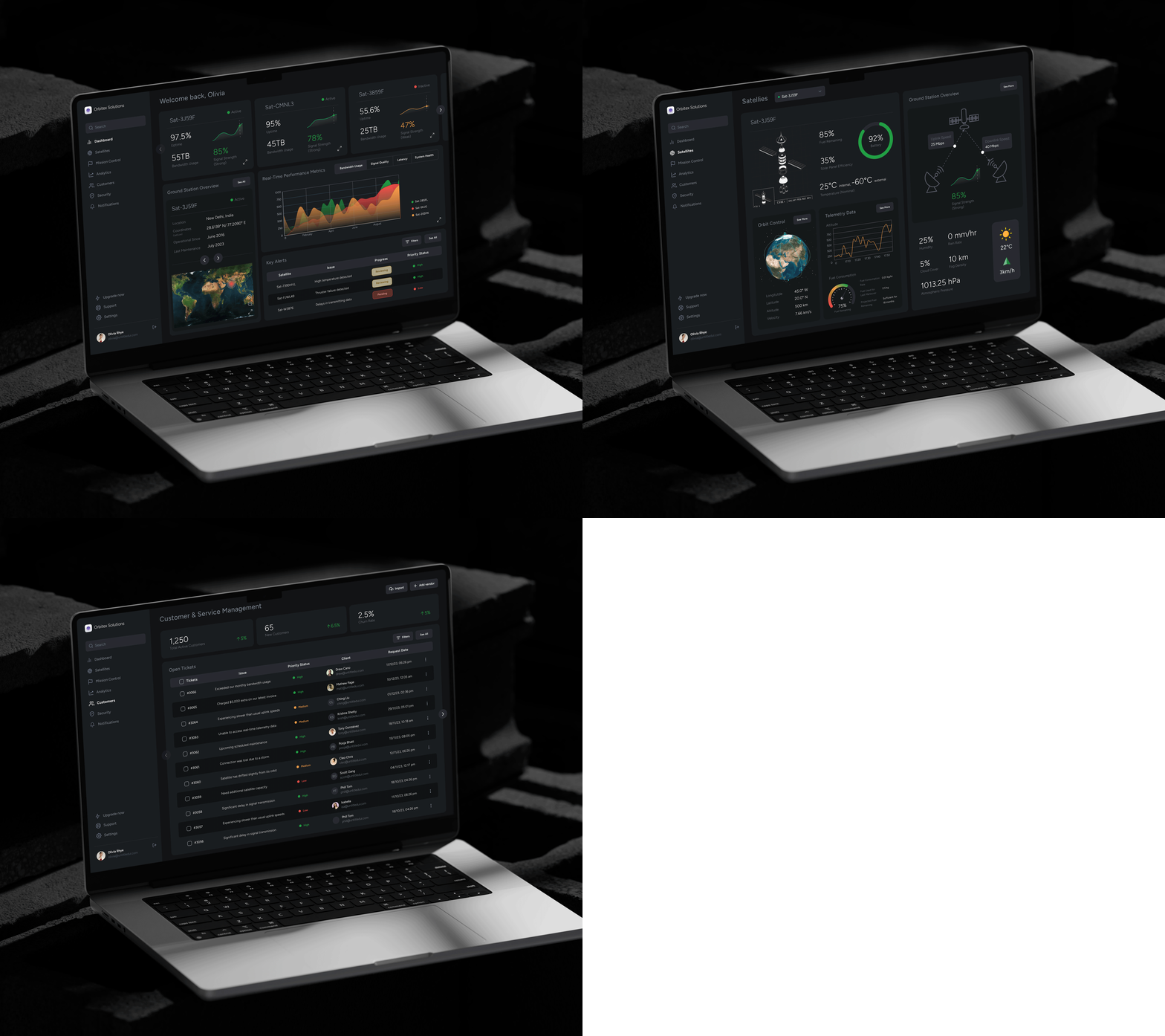
UI exercise 008
Design a few screens of a dashboard of a commercial satellite company. For this case study, I’ve worked on 3 screens.
PROBLEM STATEMENT
Dashboards for a company with complex and critical data are shown in an overly technical, disjointed, and non-intuitive manner, making it difficult for users with varying levels of expertise—such as engineers, customer support teams, and management—to access critical information efficiently. This results in delayed decision-making, slower response times to satellite anomalies, and reduced operational efficiency.
Enter your text here...
GOAL STATEMENT
Design an intuitive, clean and user-friendly dashboard that consolidates satellite data, streamlines operations, and enables fast decision-making for diverse user roles.
The most challenging part: Understanding the possible contents of a dashboard for a complex industry like satellites and learning them. I did some research (using Google and ChatGPT) and managed to narrow down the possible contents that a relevant user would need from the dashboard. It was still tough to streamline and segregate content for easy access. That’s when I picked up a pen and paper to explore the permutations and combinations which would help users to find relevant information on a single screen. Later, I converted the paper wireframes to digital wireframes.


