LOGO IamOrganic ®
🌿 LOGO DESIGN PROJECT FOR IamOrganic ® – Embodying the company's philosophy in every symbol 🌿
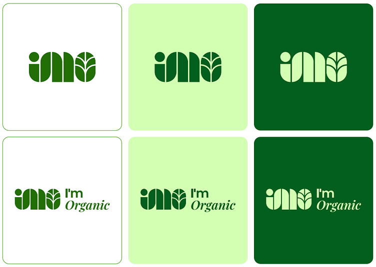
When starting the logo design project for IamOrganic, Team Mây realized that it wasn't just about arranging letters. It’s a story, a journey that the company has been building in the organic agriculture sector. Each line in the logo encapsulates the core values that the brand aims to convey.
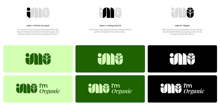
The letter "i" in "I’mO" not only represents the company but also symbolizes humanity. It reflects IamOrganic’s commitment to prioritizing human health and well-being in all its activities. In the design, I wanted to capture the warmth, humanity, and sincerity that the brand brings.
The letter "m" is stylized with soft geometric lines, reminiscent of leaves, evoking a sense of freshness and vitality. Looking at it, I can almost feel IamOrganic’s mission—to deliver the most natural and organic products, nurtured from each leaf and blade of grass.
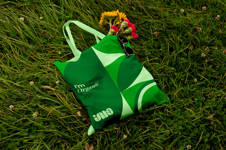
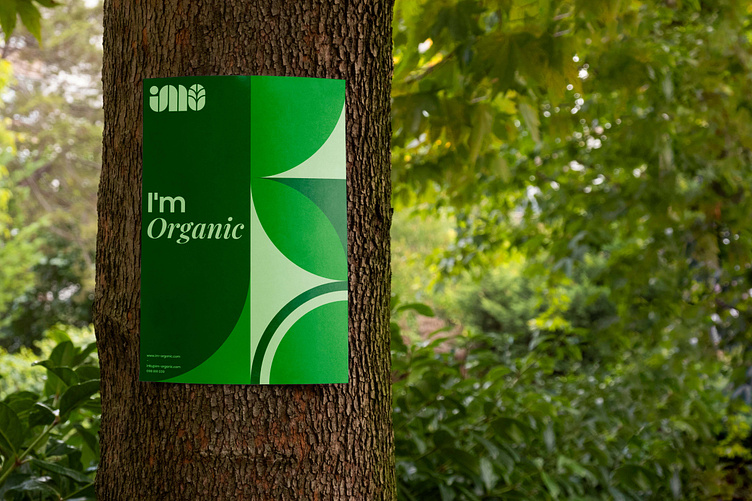
Finally, the letter "O" – I chose to depict a growing tree, representing sustainable growth. This not only ties into the company’s mission of "Eat Clean, Live Healthy" but also reflects the dedication of those who have built IamOrganic.
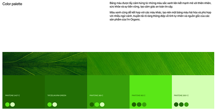
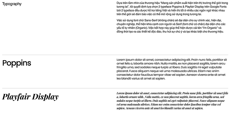
The green color palette was chosen not only for its symbolism of nature but also for the trust and safety it conveys. Combined with the two typefaces Poppins and Playfair Display, I aimed to create a balance between modernity and nature—precision and softness, much like the name "IamOrganic" itself.
Each small detail carries a lot of passion, and I’m proud to have had the opportunity to work with IamOrganic and convey their message through the logo.
The project showcase will be launched to everyone soon!
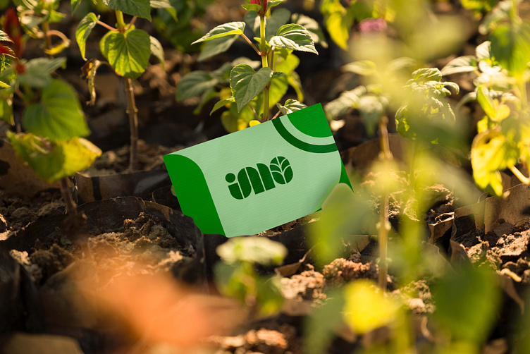
Industry: Agriculture
Client: IamOrganic
Scope of work: Logo - Namecard - Cover - Trademark Protection
Designer: Công Võ
Account Manager: Hà Vân
Team: Mây Design