Mala Mia Visual Identity
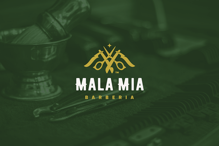
To construct the symbol, I illustrated two razor blades joined in opposite directions to represent the letter "M" from the brand’s name, and a stylist's scissors in the middle to represent the letter "A," both letters being key components of the brand's name. Together, they form the logo’s symbol in a symmetrical, centered, and perfectly aligned design.
Now, it’s understandable that cutting the middle of both sides of the scissors might raise questions. However, this is all about visual psychology. If I had placed them aligned without the cut, from our visual perspective, it would appear as though they were cut and that the finger rings are lower.
For the symbol, certain details have been added to create depth. These are cuts designed to generate shadows between elements, and based on each shadow, we can identify which elements are on top or in front of others.
As for the star placed above everything, it is a personal detail added to represent the perfectionism that serves as a goal in the service, while also adding a touch of elegance and extravagance.
Mala Mia Visual Identity
_______________________________________________________
Follow me:
Instagram | TikTok | Pinterest | Youtube
—
I'm available for new projects - dichisitodesigns@gmail.com
Show your support with a like ❤️
And share your thoughts in the comment section!
Thank you!


