Milestone
the identity of the IT company
Milestone IT company operates in the B2B sector and holds a leading position in the field of application development for the tourism sector. Now the company is entering the international market and in order to gain a foothold in new countries, it needs a new, modern identity. The client came with a request to create not just an identity, but a unique style that would be atypical for the IT sphere, opening up opportunities for us to experiment. The Milestone team are people who are in love with tourism. We had to create a style in which it would be pleasant to live and work, not only for customers, but also for employees themselves, a style that would not only attract attention, but also have meaningful content.
chocolate programming
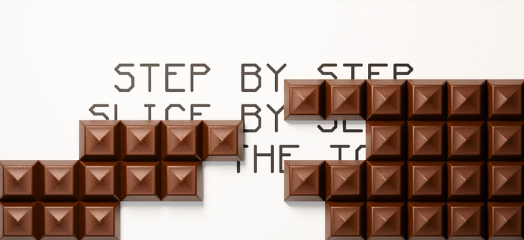
Our team conducted a study to find the intersection points between two, at first glance, completely different spheres: IT and tourism. So we found out that in the IT field there are milestones - intermediate stages in the development of a project or key points in the project, when reached, which a pool of tasks must be completed. The field of tourism is also characterized by the division of the path into stages, the passage of each stage ends with a halt. But, interestingly, in tourism, each stage is also symbolically rewarded with the so-called "transit chocolate bar". When a certain point on the route is reached, the chocolate is divided between all members of the group. Through the image of a chocolate bar in the identity, we show that the Milestone team does not just develop applications on request, but goes through each stage of project development together with the client's team, like a tour group. Moving up to the top step by step, piece by piece. As a result, in identity, we combined the structure and consistency of both spheres through modularity and strict rules in the construction of layouts, found new connections between the spheres visually reflected in the "chocolate" of the media, but at the same time retained direct associations with each sphere: photographs of mountains and hiking, monospaced font.


