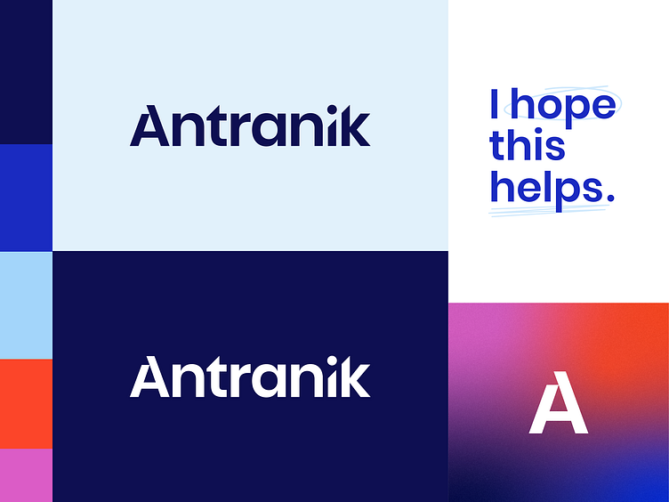
Antranik - Logo design
Our team had a blast working with Antranik Kizirian, a fitness and wellness guru based out of Los Angeles. This rebrand was inspired by Antranik's authentic online presence and mission to inspire others towards leading better lives.
Antranik's primary logo is built from strong geometric forms and angled shapes to create balance between implied motion and stability.
Gradients are used throughout the brand expression to represent transformation, growth, and variance. They also reinforce Antranik’s belief that progress isn’t always linear, but rather unique to each individual's journey and goals.
Made with 💜 in Kansas City
Website / Get a Quote / Instagram / Clutch
More by Lifted Logic View profile
Like
