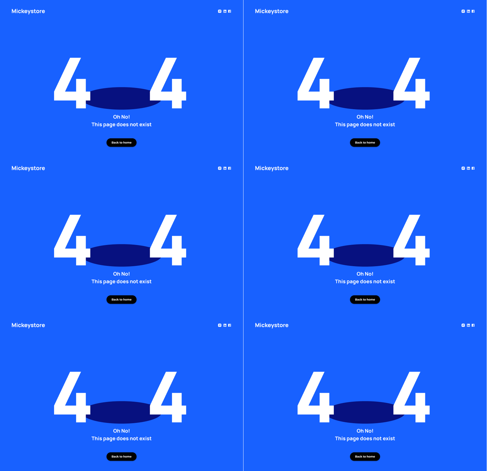
Daily UI #008 - Error 404
For today's challenge, I designed a clean and minimalist 404 error page for Mickeystore. The goal was to keep the layout simple yet impactful, with bold typography and vibrant colors to grab attention while still delivering a smooth user experience.
🔵 Design Highlights:
A bold, eye-catching "404" design with playful shadow effects.
Friendly and straightforward error message to keep things lighthearted.
Simple and effective color contrast for readability.
A clear "Back to home" button for easy navigation.
Minimal social media links to stay connected.
I’d love to hear your feedback and thoughts! How would you handle a 404 error page for your site?
More by Saksham View profile
Like


