Maison Port

Logo and Visual Identity for a Real Estate company from Spain.

Maison Port

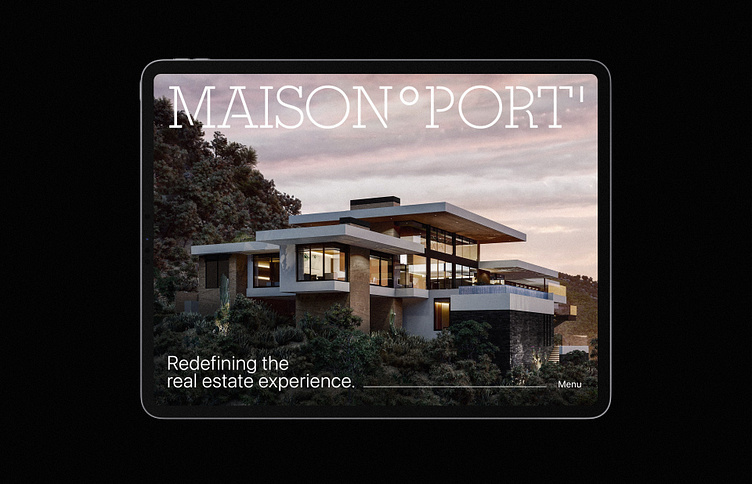
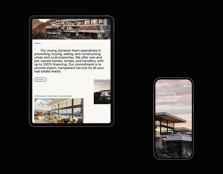
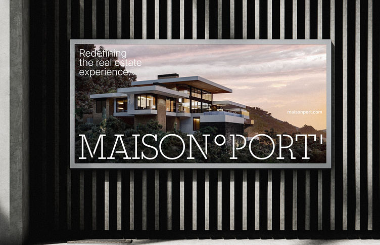
Redefining the real estate experience.

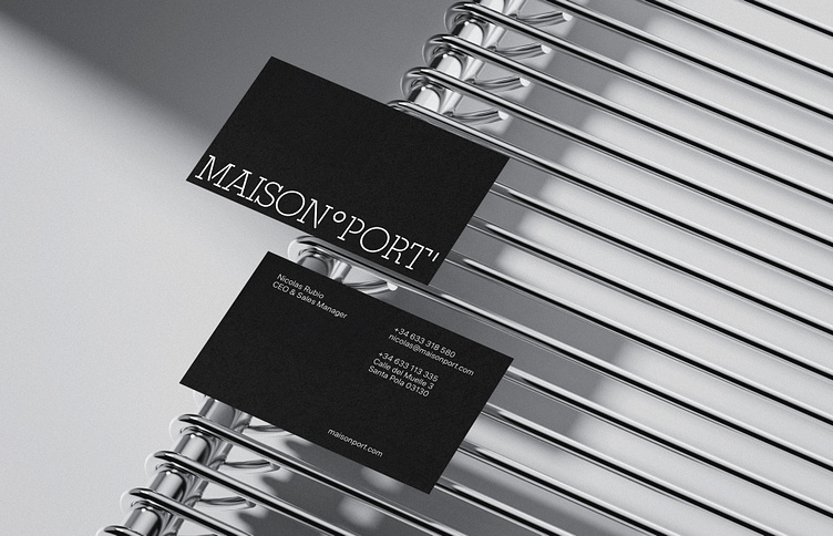
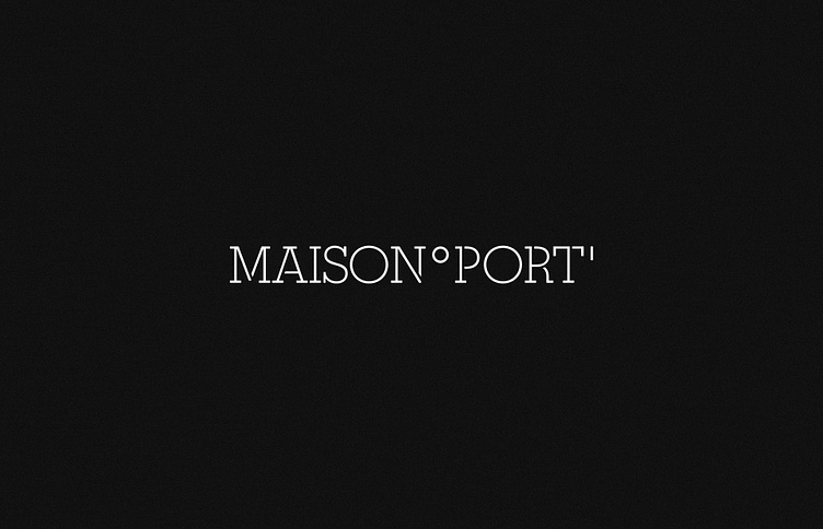
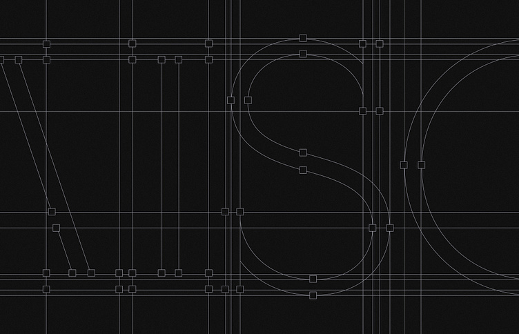
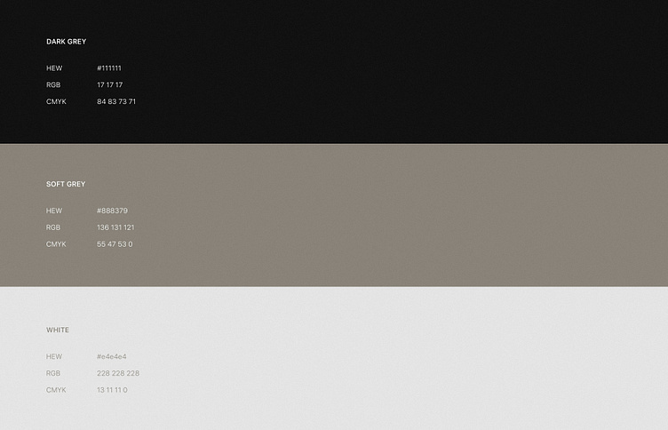
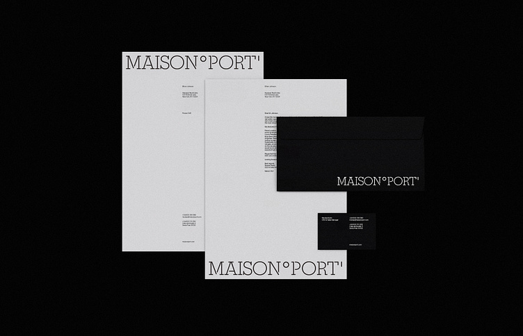
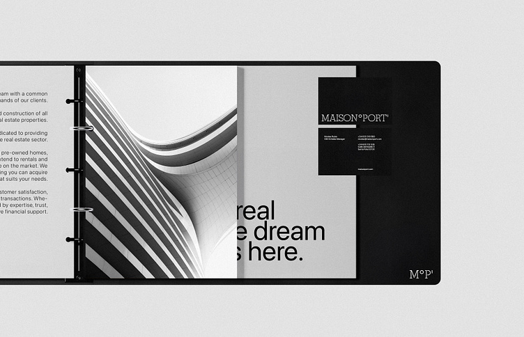
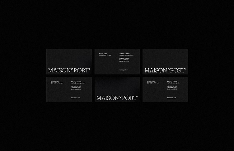
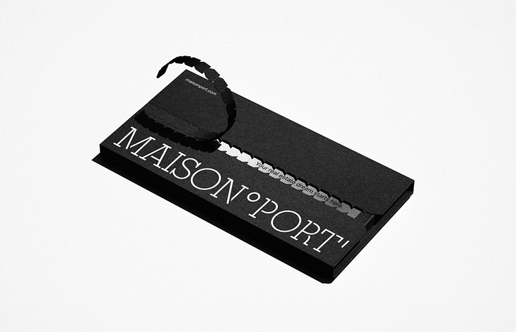
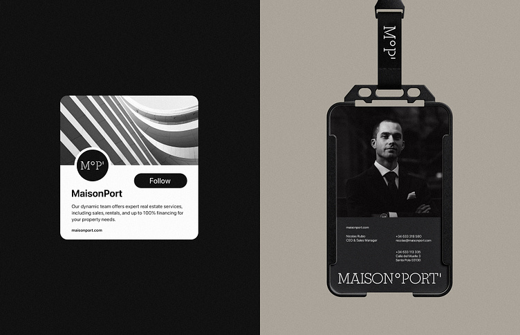
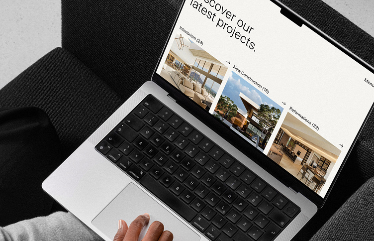
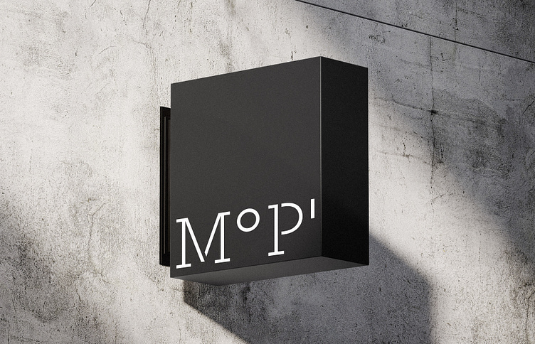
Maison Port operates at the intersection of real estate and innovation, offering comprehensive property solutions with a focus on client satisfaction. The logotype incorporates geographic longitude, measured in degrees (°) and minutes ('), as a graphic element representing the coordinates of a specific point, symbolizing the precision and stability of finding the perfect home. The design features a neutral yet vibrant color palette, symbolizing the brand's balance of professionalism and dynamic services. This version showcases the initial concept; the final client-approved version evolved to align with updated strategic goals.

​​​Client: Maison Port

Case: Visual Identity + Website

Logo and Visual Identity for a Real Estate company from Spain.
Color Palette for a Real Estate company from Spain.
Logo and Stationery design for a Real Estate company from Spain.
Typography selected for a Real Estate company from Spain.
Stationery for a Real Estate company from Spain.
Business Cards for a Real Estate company from Spain.
Tear Strip Packaging for a Real Estate company from Spain.
Logo and Visual Identity for a Real Estate company from Spain.
Website for a Real Estate company from Spain.
Store Sign for a Real Estate company from Spain.
Billboard for a Real Estate company from Spain.

Thanks for watching.

For business inquiries:

alvarocabeza1988@gmail.com

© Alvaro Cabeza 2024. All rights reserved.

More by Alvaro Cabeza

View profile